According to the internet, a gentleman named Mueller has written a report. I’ve not read it and have only the haziest notion of its content, gleaned from the Twitterati.
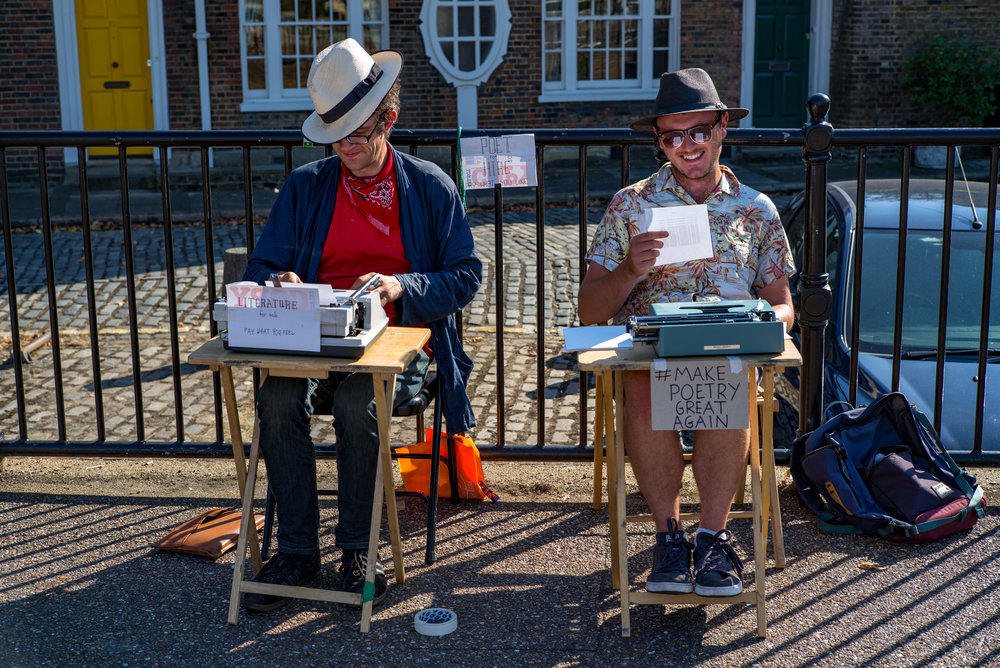
What interests me about this report I haven’t read is that the text was almost certainly typed by a person of advanced years, someone who spent most of their life pounding a mechanical typewriter. It could even have been the 75-year-old Robert Swan Mueller III himself.

Conventions
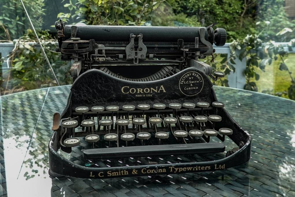
How do we infer this? Well, whoever typed that report adhered to the old typewriter convention of adding two spaces after punctuation, notably the full point, period, stop, or full stop. Until the computer came along, with its unbridled access to a vast range of proportionally spaced type fonts, the typewriter was my workhorse and every character had the same space.
Typewriter manufacturers, in the main, offered us two typefaces, both similar. One was Pica and the other Elite. If you wanted a machine with a larger typeface you’d go for Pica, spaced at ten characters per inch, while the smaller Elite face, with twelve characters per inch, was often preferred by individuals for private correspondence. It was somehow more personal.
There were other distinctive fonts available to special order. I remember government ministers and departments preferring an extra-large large typeface which underscored their importance.
Monospacing

The significant aspect of all these typefaces was that they were monospaced. Every character, whether

Computers were easily capable of handling proportionally spaced fonts, such as the ubiquitous Times Roman, and ordinary mortals were able to produce texts which looked every bit as good as the printed page.
It dawned on users that adding two spaces after punctuation created an ugly white splodge amid the close-knit typography. Experienced typists then trained themselves to avoid the traditional double-tap on the space bar. I was one of them.
No-spacers
Now, I suspect, the vast majority of writers use the one-space convention.
But I do know of one unique individual who uses the no-space convention — with the next sentence merging into the previous
Another friend, a neighbour, is willing to stake his life on the use of two spaces after a point. When discussing the issue recently he was
Undoubtedly, though, the two-space versus one-space issue is no longer relevant. Anyone who learned to type on computers, probably anyone under 40, will use the one-space method.
Oldies are mixed in their prejudices and this leads to the suspicion that Mueller the Third prodded the computer keys himself when producing his epic.
Qwerty
While this convention has surrendered to the computer age, the main relic of the typewriter age lives on in the form of the keyboard. At a very early age, I learned to pronounce it as a sentence: Qwerty-you-ee-op,
Now, of course, it’s all in the muscle reflexes. But it need not have been if the new computer had been accompanied by a
Here we are in 2019 and it seems unlikely that the qwerty keyboard, with its many faults, will be superseded any time soon. It is far more likely that voice recognition will bring the keyboard era to an end, especially for day-to-day writing and web browsing.
Related Articles
- Why the Mueller Report has two spaces after every sentence
- The humble typewriter through rose-tinted glasses
- Ode to the typewriter: Analogue poetry in motion
- Hanxwriter, Tom’s virtual typewriter for nostalgia buffs
- Johnny typewriter comes in from the cold
- Spooks put new life into the typewriter industry
- Kids’ reaction to typewriters: Feel sad for people who had to use them
- Ancient laptop: Olivetti Lettera 22
- Typewriters out, computers in
- The world’s most beautiful typewriters


Sidecars are such fun. Ben Matthews of Watsonian-Squire has brought outfits on a couple of occasions so it would be great if he’s there tomorrow with one. Perhaps we could persuade you to get in the chair?
We covered the sidecar point yesterday but if you do exactly the opposite to that shown in this video – i.e. reverse all actions for a sidecar mounted on the left of the machine – you’ll be OK. https://www.youtube.com/watch?v=rFIr8BZCaLk (For left-mounted sidecars, I would have added that it’s good practice to accelerate round left-handers so the bike drives round the sidecar. And also brake round right-handers so the reverse happens, unless of course, you have a coupled sidecar brake. Doesn’t it get complicated?)
Apart from having an ultra-light sidecar, my first Brough outfit also had very little ‘lead’ (the distance the sidecar wheel axle is in front of the bike’s rear wheel centre) so you had to be very careful going round right-handers as the rear wheel would leave the ground. I counteracted this by putting my weight as far back on the bike as possible.
A variation on the sidecar theme is, of course, the leaning sidecar, going way back to Freddie Dixon’s sidecar TT victory in the 1920s and periodically rediscovered, latterly by a US manufacturer of the ‘Flexit’. See: https://www.youtube.com/watch?v=zxN09PefhEs
Watsonian-Squire imported one and attached it to a Hinckley Triumph 1200. I borrowed it and the sensation was great but the dynamics were all wrong. Hardly any lead on the sidecar wheel so that a heavy sidecar passenger virtually levered the rear wheel of the bike off the ground.
Oooerr….. I haven’t packed my crash helmet (a terms which is probably non-PC in the motorcycle industry these days) and I’ll be carrying a couple of Leicas, so not so sure. And if it’s a open car and it’s raining…..
I once went all the way to the Nurburgring in Germany (in the middle of winter ice and snow) in a sidecar piloted by the incomparable, irrascible and superbly talented Vic Willoughby, technical editor of the magazine I worked for. That was an experience. Vic was notorious for “pressing on” and didn’t take kindly to my pleas for a pit stop. I think I had an iron-reinforced bladder in those days.
But at least I fared better than his long-suffering wife who accompanied him on the pillion of his AJS for a two-week holiday in the Dolomites. On returning to the office, Vic was incandescent: “Bloody woman,” he complained, “we set off from Calais and we hadn’t got to Stuttgart before she wanted to stop for a coffee.” The only sort of PC Vic recognised were the ones who stopped him for speeding. Then again, non of us had heard about political correctness then. Happy days.
I have a fund of anecdotes about Vic, a pre-war Brooklands racer. On one occasion he was road testing a Vincent up the A1. He was stopped for speeding twice in quick succession. Unfortunately, the second instance came up before the lady magistrate ahead of the first misdemeanour. The policeman opened his notebook and told the court that, on being stopped, Mr Willoughby had exclaimed, “Jesus Christ, not again.” Result, fine, larger than warranted. No points in those days otherwise Vic would have been deskbound for the duration.
Vic was a man for whom the adage about not suffering fools gladly was invented.
“..Computers were easily capable of handling proportionally spaced fonts, such as the ubiquitous Times Roman, and ordinary mortals were able to produce texts which looked every bit as good as the printed page..”
And how did that come about? Because Steve Jobs took a – darn; isn’t it annoying when you know what you want to say ..and in transferring the thought into words (spoken or written) somehow the very word(s) you’re about to use can just disappear between the thought and the practice? – took a whaddyamacallit, a – there, it’s happened again – a, er, TYPOGRAPHY (gottit!) course at college, and so he insisted that the Macintosh (..though he was beaten to it by the Apple Lisa..) would have proportionally spaced fonts.
(Remember, the Apple ][ and the IBM PC had just a monospaced screen font ..as did the Tandy ‘Trash-80’ and all the rest of them before the (Lisa and) Mac.)
This website has proportionally spaced fonts ..thank Steve!
Oh, and I leave two spaces after a ‘shriek’ (exclamation mark), as it looks so unsightly to have a capital letter – at the start of the next sentence – visually crashing into the upright of the !, dontcha think?
Yes, of course, we owe a lot to Steve Jobs’s typography course. Who knows, monospace-ism might have become the world religion. Space before an exclamation mark? Not in my name.
No, no: two spaces AFTER an exclamation mark!
But the double spaces got obliterated in the previous post !!!
Actually, I try to use double space after full stop. When I remember. I also like both margins justified if I want to give a slightly more spacious look without too much fiddle. If you know what I mean ! And I often put a space in before a question mark or exclamation mark. Does anyone else ?
Ah! A space before a query or exclamation would annoy me intensely, apart from being rather quirky. Have you ever seen this in print? While queries are unavoidable, the exclamation mark is entirely avoidable and, perhaps, best reserved for special occasions. But then that’s just my opinion and I still think the earth is flat.