It’s fashionable in every review of Sony cameras to complain about the complexity of the menus. My current exposure is to the RX100 VI menus and, at first, their complexity is indeed daunting. I’m not sure that Sony is worse than other manufacturers, once you get used to the tabs and pages, but I tend to prefer Leica and Panasonic’s less fussy approach.

Most dedicated Sony users are happy with their menus and just prove the old adage that it’s easy when you know how. The trouble with most reviewers is that they have to adapt repeatedly to a succession of new cameras and menu layouts and, I suppose, they can’t be expert on everything.
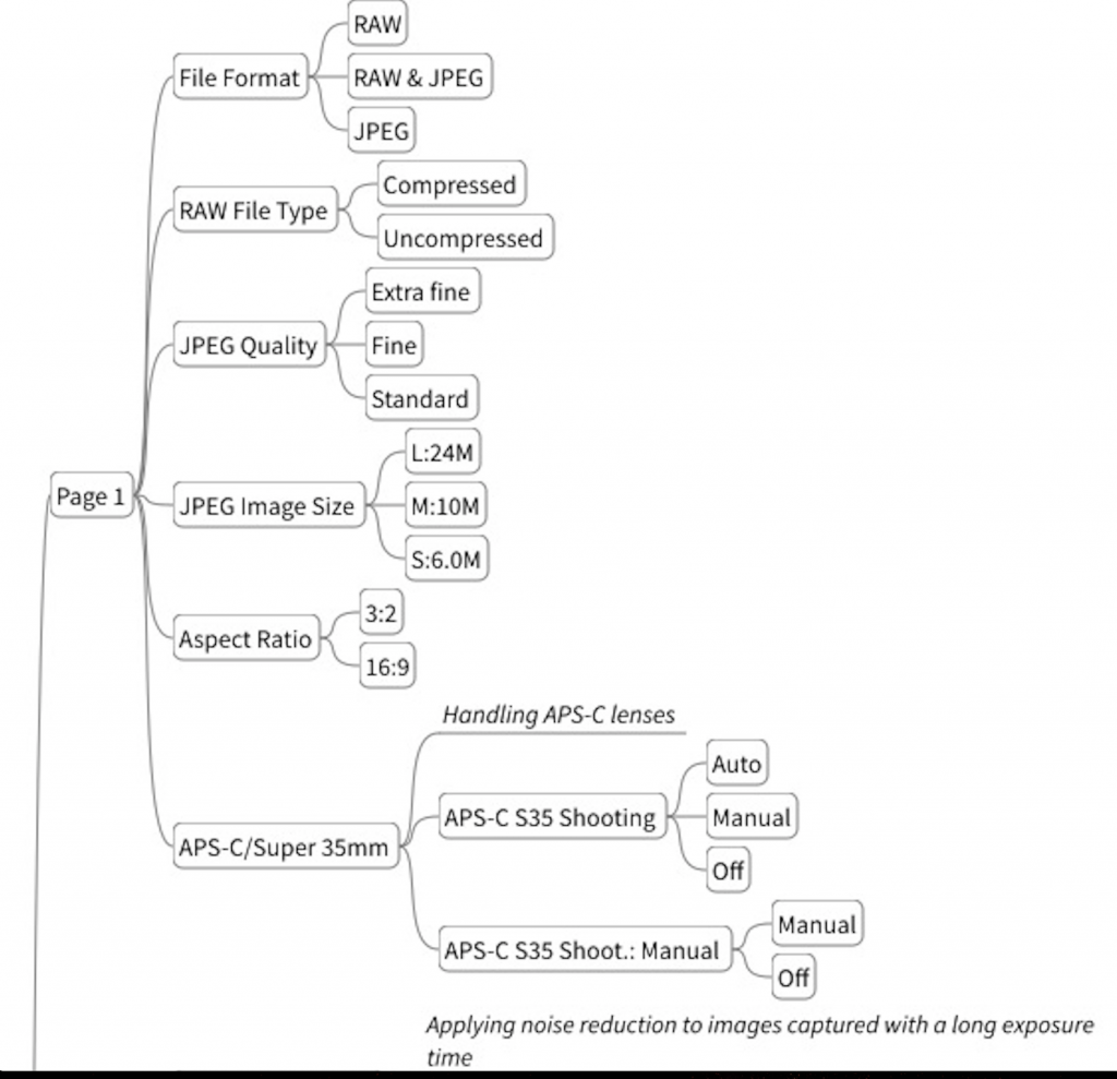
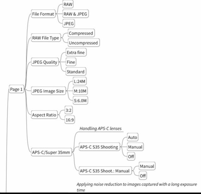
What helps, if possible, is to visualise the menu system as a mind map. Some camera manufacturers include schematics in their manuals and there are probably mind maps of many camera menu systems available on the internet.
Recently, though, I was struck by one photographer’s efforts to analyse and display the intricacies of the Sony A7 Mark III menu system. Dimitri Popov started out with what he thought was a simple task, to make it easier to master menus. But, as Dimitri explains:
“This project quickly evolved into a major, and rather fascinating undertaking… It’s not a secret that the menu systems of any Sony Alpha camera can be charitably described as advanced. But you can only appreciate its intricacy and sheer complexity when the entire system is laid bare in front of you. I spent several days mapping the menu system, and it felt like exploring an uncharted world.”
The resulting map, according to his article in PetaPixel, is mind-boggling. It contains around 900 nodes, each corresponding to an individual menu item. We can be thankful that Dimitri has done the hard work and you can purchase the mind map, including an open-source mind-mapping tool for instant viewing. Alternatively, you can import the map into the most popular mind-mapping applications.


The Sony menu’s are far from great, but a proverbial walk in the park compared to some of the opaque madness that is the Olympus menu system.
I sold my sony A7 for many reasons, the menu system is one of them but not the only one. I wanted to love the camera when I bought it, obtained amazingly clinical results but I personnaly did not like the imaging despite the amazing sensor. Complex menu systems have also kept me back from buying other brands. Why camera manufacturers don’t keep it simple like the Leica or the tad more complicated Ricoh menus?
Stay all safe
Jean
There is this tendency, as was pointed out earlier, to throw every conceivable bell and whistle into the modern camera and this results in over complicated menus. However, there is still a demand for a more basic camera, something which Leica offers particularly in the M10 or perhaps more so in the -D which.
I sold my A7R2 with some regret, but IMO the menu was an inexcusable mess. Coupled with the inability to customise it sufficiently, though I understand this has been partially solved in newer models. I owned Olympus bodies for several years and though their menus were complex, they at least had some logic to them. I found no logic with Sony.
A shame, as the sensor was capable of some amazing results.
Cheers,
Don
I’ve always thought of SONY as being a company that is good at making audio.At least they used to be. They only have one significant product on the market these days, which are the noise cancelling headphones/earphones. They’ve gone Hollywood these days. Complex menus are the absolute worst thing ever to happen to cameras, maybe next to shrinking viewfinders, and I’m so happy that Leica realizes this. I’m not even half thinking about buying a Sony camera.They are not the only culprit. i still have nightmares about setting up an Olympus EM-5 some years ago, and I thought I knew how to use a camera.
I too suffered the Sony menu burnout (A7RII). And I’ve been through the Nikon (made modest sense) and Canon menus. I confess one reason for my Leica fascination is the menu system. Sure, there’s stuff I wish I could tweak, but probably wouldn’t anyway because it would be buried too deep. I just want to take the damn picture.
Coming from the consumer electronics world, Sony tends to throw the proverbial kitchen sink at a product- just witness the piles of stickers on any of their audio or TV products. To consumers, more stickers means better.
But I sympathize with Sony. Having been in the embedded software world, I have played a small part in user menu angst. Think about it. You have a function to implement, and lots of opinions on how much control to give the user. Too little, and they complain. Too much and they still complain, but they also burn out and don’t use it. Which is good, because they never discover the logical dead ends or bugs inherent in shipping before it’s time. After all, YOUR code time is now occupied with the next hot product. Rinse and repeat.
Consider the 800 pound gorilla- language. How do you make sense of where to put a function when you need to express it in English, Italian, German, Kanji, Kana, Mandarin, Arabic, and on and on? We are driven by our native language. Alphabetical? Whose alphabet? We think and evaluate concepts in out native language. How would you explain focus stacking setup? How about ‘profiles’? What the hell is a ‘Control Wheel’? And then two or more programmers build in similar functions in each of their chunks of code. Marketing wants it all. Besides, it takes longer to take it out (all that testing). Where do you put it? Two (or more!) places? What overrides what? Those are called “undocumented features”. I’ve seen language consultants nearly come to blows as they go back and forth. But then, how can one go ‘back’ before one goes ‘forth’? In the end, you shrug and throw a dart. Let support worry about it.
Long live Leica menus!
Excellent Bob – beautifully put – as someone who is dealing with a software system written over the last 25 years and constantly updated I really appreciated that!
Worth mentioning the real effort that Leica put into keeping it simple in the face of a deluge of requests for that ‘one important feature’
Congratulations, you really must love that Sony to accomplish such a task , and I am sure it will be appreciated by SONY Users. In a way I am sorry that this reaffirmed all I have read about their system, too bad they could not made it easier.
Oh, maybe this is one of the reasons i dumped my A7R system- beautiful glass horrible haptics. I never mastered menu after 4 years and had to add aftermarket stainless steel nipples on buttons.