As a beta tester, I’ve had the pleasure of putting a prototype of the new M10 Monochrom through its paces well before the launch date. As usual, I’ve been hopping around on hot coals, just waiting for the green light to give you my views on this new and unusual camera.
At the outset, let me say that I am not a typical user of Leica’s monochrome digitals. A few years ago, purely out of curiosity, I tried out the M9-based camera. At that time, I came to the conclusion that working with a dedicated black-and-white camera in the long term would simply be too great a limitation. Fortunately I was able to return the camera, which I had purchased myself, after a few months without losing value.
The camera
Cost/benefit versus Cost/want
For me, the high level of investment was not justified because, as a professional photographer, I have to pay attention to the cost/benefit factor (although, I admit, I sometimes ignore this because of the conflicting cost/want factor). But I’m not in the financial position to purchase such a specialised implement as a third or fourth camera. There are simply more aspects of greater importance.
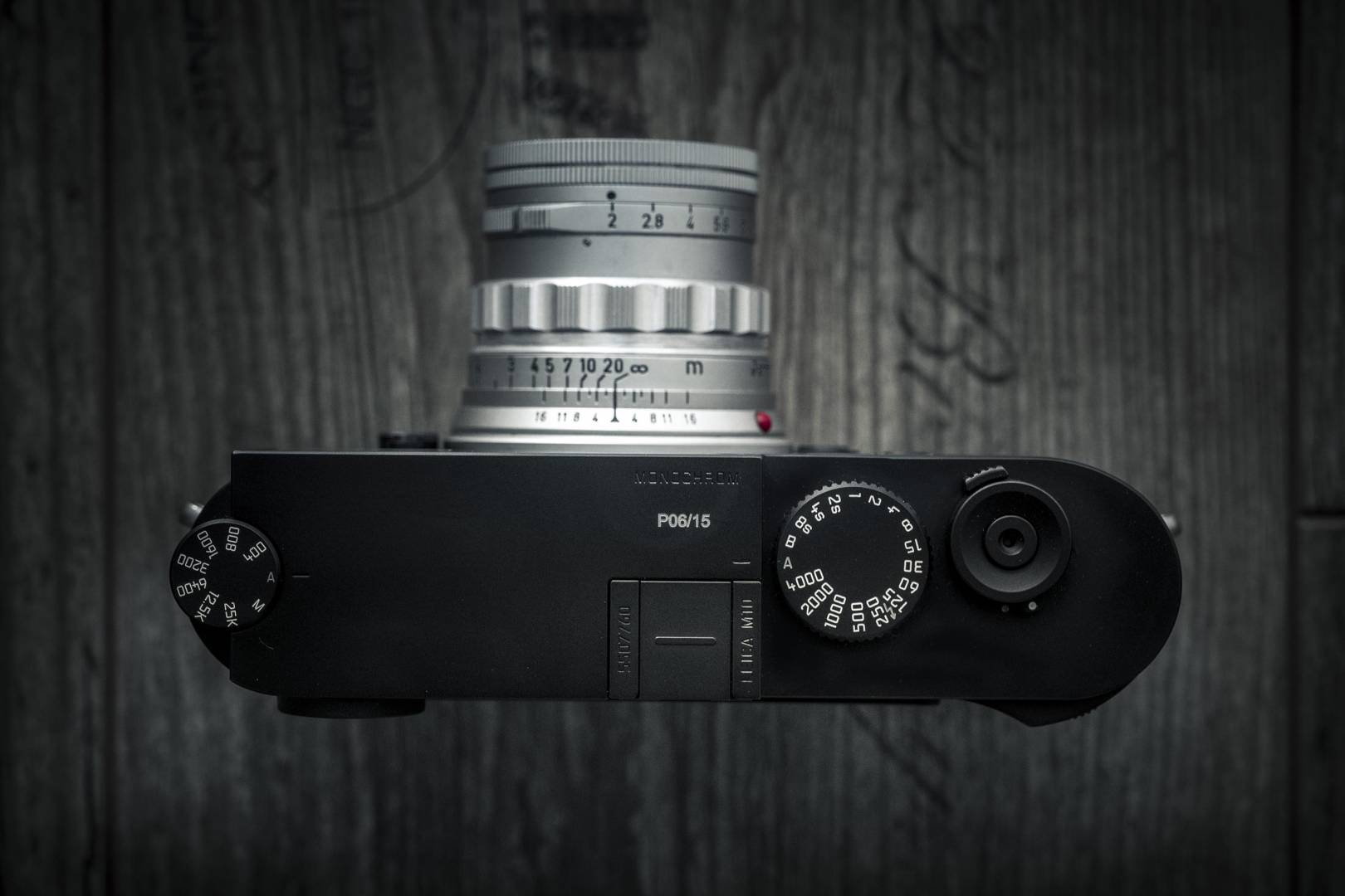
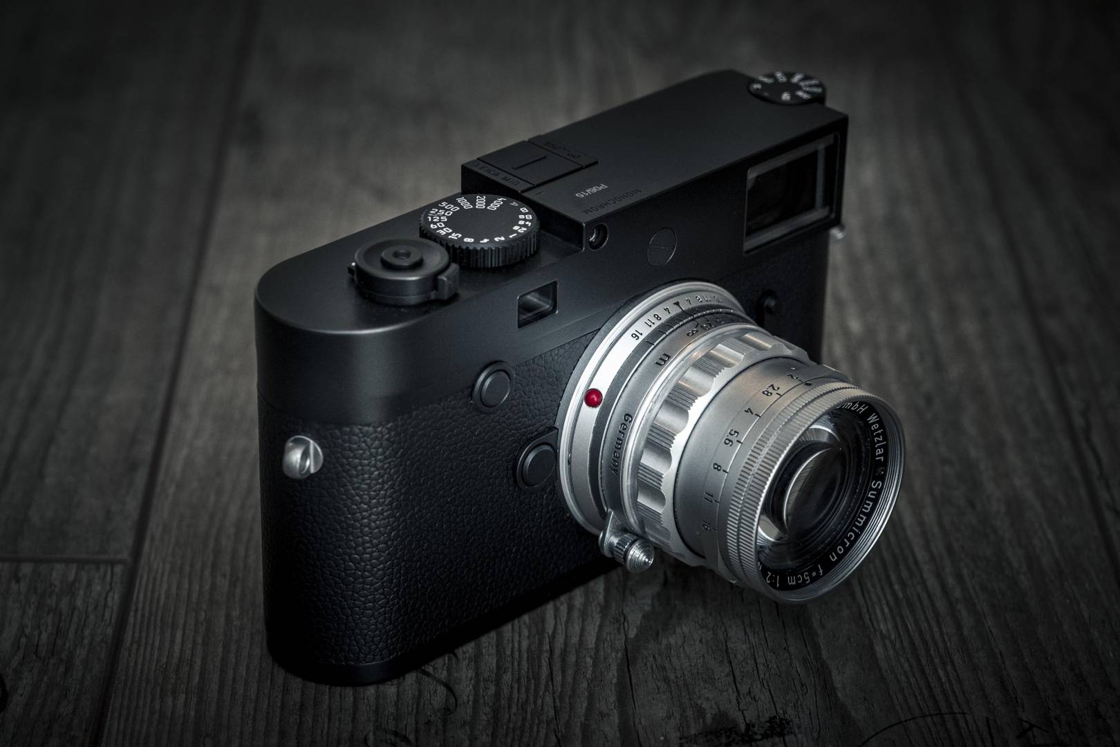
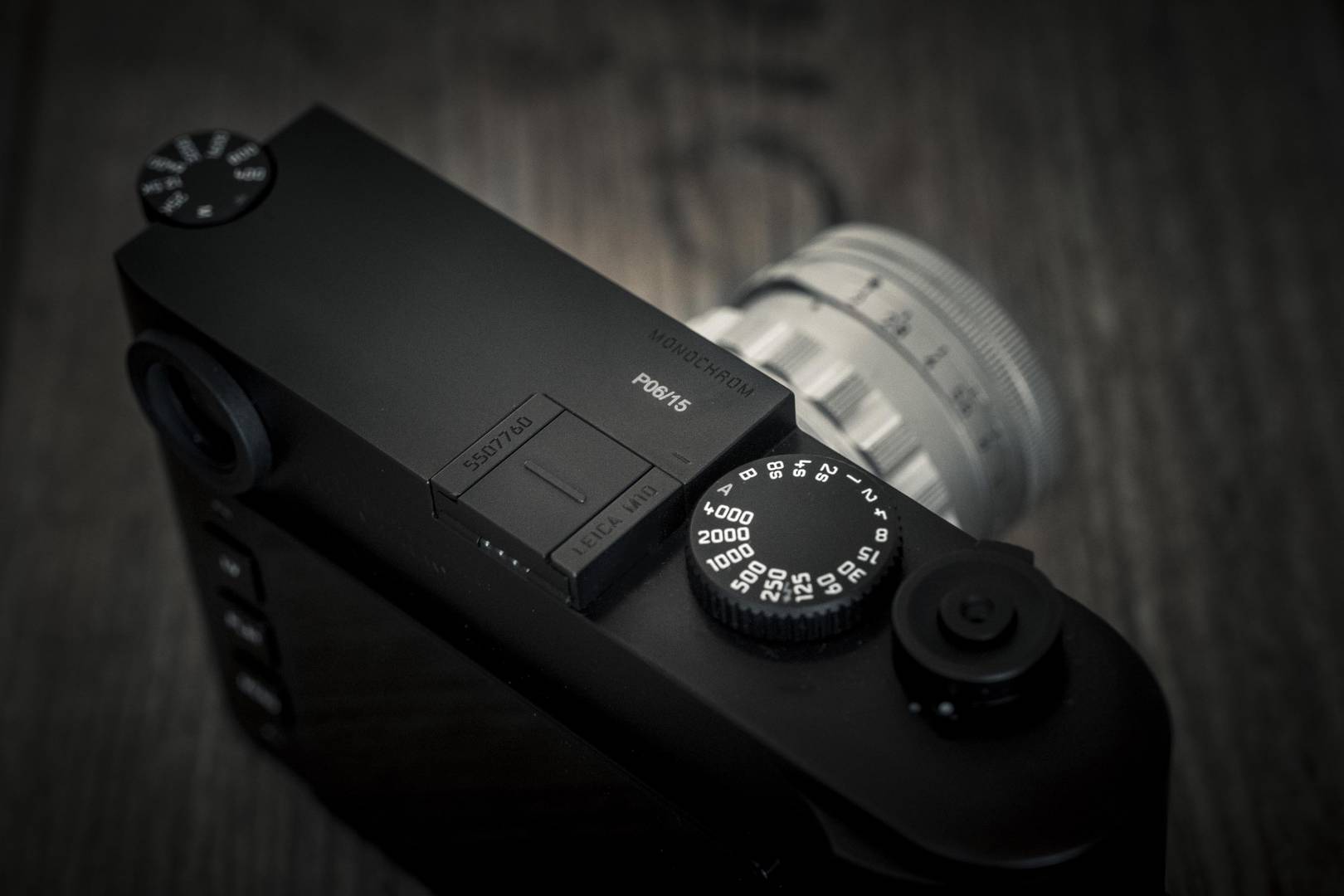
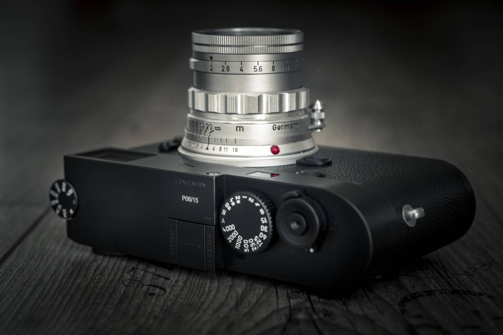
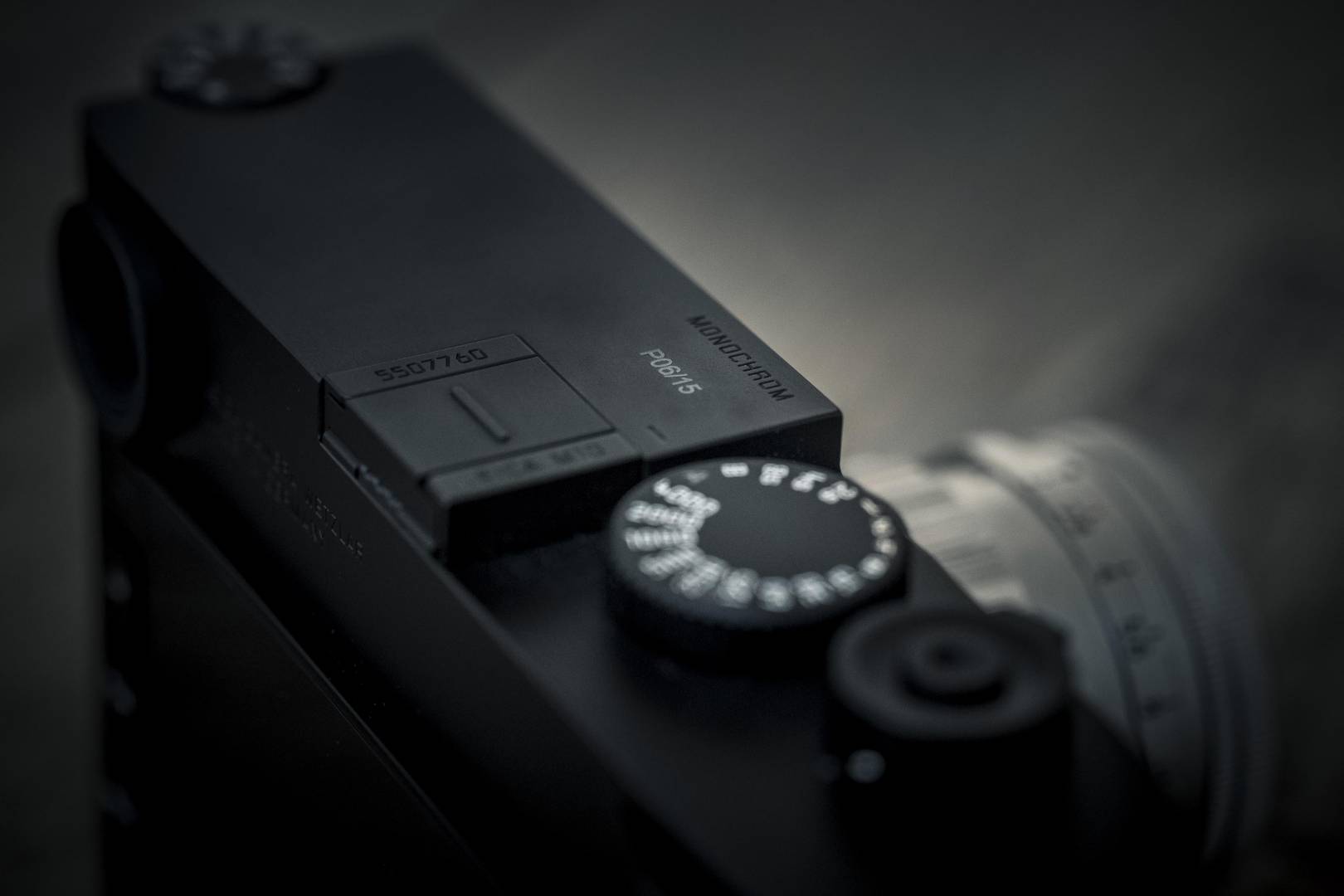
With this in mind, I was all the more delighted when Leica chose me as one of the select few to take part in the M10 Monochrom beta-testing programme. The picture of “my” camera demonstrates, from the P number, that it is No.6 out of 15 proto-brethren.
Despite my not being a typical Monochrom buyer, I just had to find out what this new, svelte high-resolution king is all about. In the end, after a good month with P6, I have to say that I was reluctant to hand back this beautiful device. Above all, I found it hard to resist the temptation to pre-order a production model.
So now on to my little report.
As with all my previous reports (see Macfilos link below), I would like to make it clear that I am not a professional tester and that my views reflect those of an absolute practitioner who does not possess any fancy laboratory testing equipment. In the following report, there is minimal objective testing. Instead, I have striven to create an overall impression of this camera as a photographic tool.
Design and technology
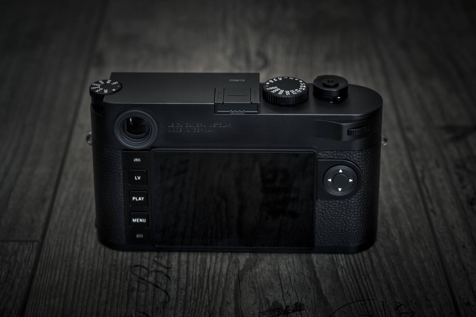
Let’s start with design and technology. Above all, I can say that the M10 Monochrom is an object of beauty. The prototype was a stealthy, black creation (as will be the production cameras) and I have to say I haven’t handled such a nice digital M before. It feels just like the normal M10, of course: A perfect and solid body with the same narrow dimensions — virtually the same as those of the old M7 — clothed in a very tactile, somewhat softer leather jacket.
The top and bottom plates are black chrome-plated, not painted as you might have thought, and the surface has a velvety feel that I really love. Overall, it’s a wonderful and very subtle design, devoid of logo or identification save for the blacked-out “Monochrom” designation. The A and lightning symbol of the speed dial and the A on the ISO wheel are both filled in grey rather than red, thus adding to the monochrome effect. As with the M10-P, the display glass is made of a scratch-resistant sapphire crystal.
The shutter release is very pleasant and unobtrusive. It is the same noise you’ll hear when you press the shutter of the M10-P, which is even quieter than that of the normal M10. This, and the discreet appearance all serve to make M10-M the most inconspicuous of Leicas.
Overall, this M10 Monochrom is technically identical to the M10-P, with the same controls and operation. The only difference is that all-important higher-resolution 41.9MP sensor and that, in a nutshell, is the whole raison d’etre of the new Monochrom.
Comparative tests
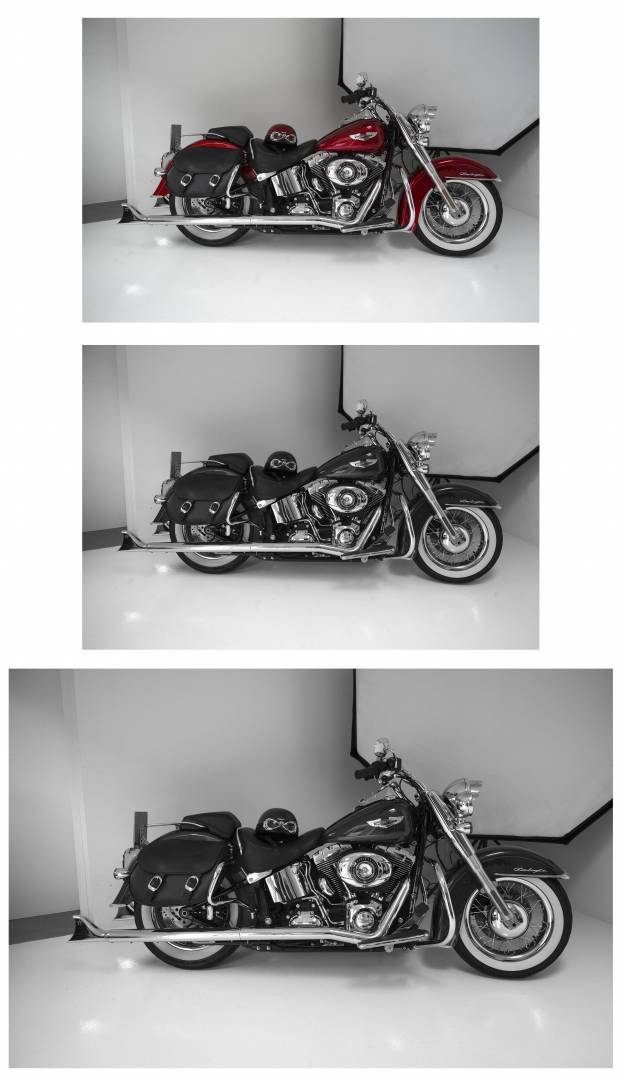
Now to my little picture test. I was primarily concerned with image comparisons between the M10 Monochrom and the current colour-sensor sister M10. Therefore, in the following tests, I took a picture in the daylight studio with my tripod-mounted M10-P and the M10-M under identical conditions. In the processing of the DNGs (with the Photoshop RAW converter), I then generated colour images and a black-and-white from the M10-P and also developed the monochrome DNG from the M10-M using the same parameters.
Here are the full-frame images in the following order: M10-P colour, M10-P black and white and M10-M monochrome.
Then a 100% crop follows in the same order:
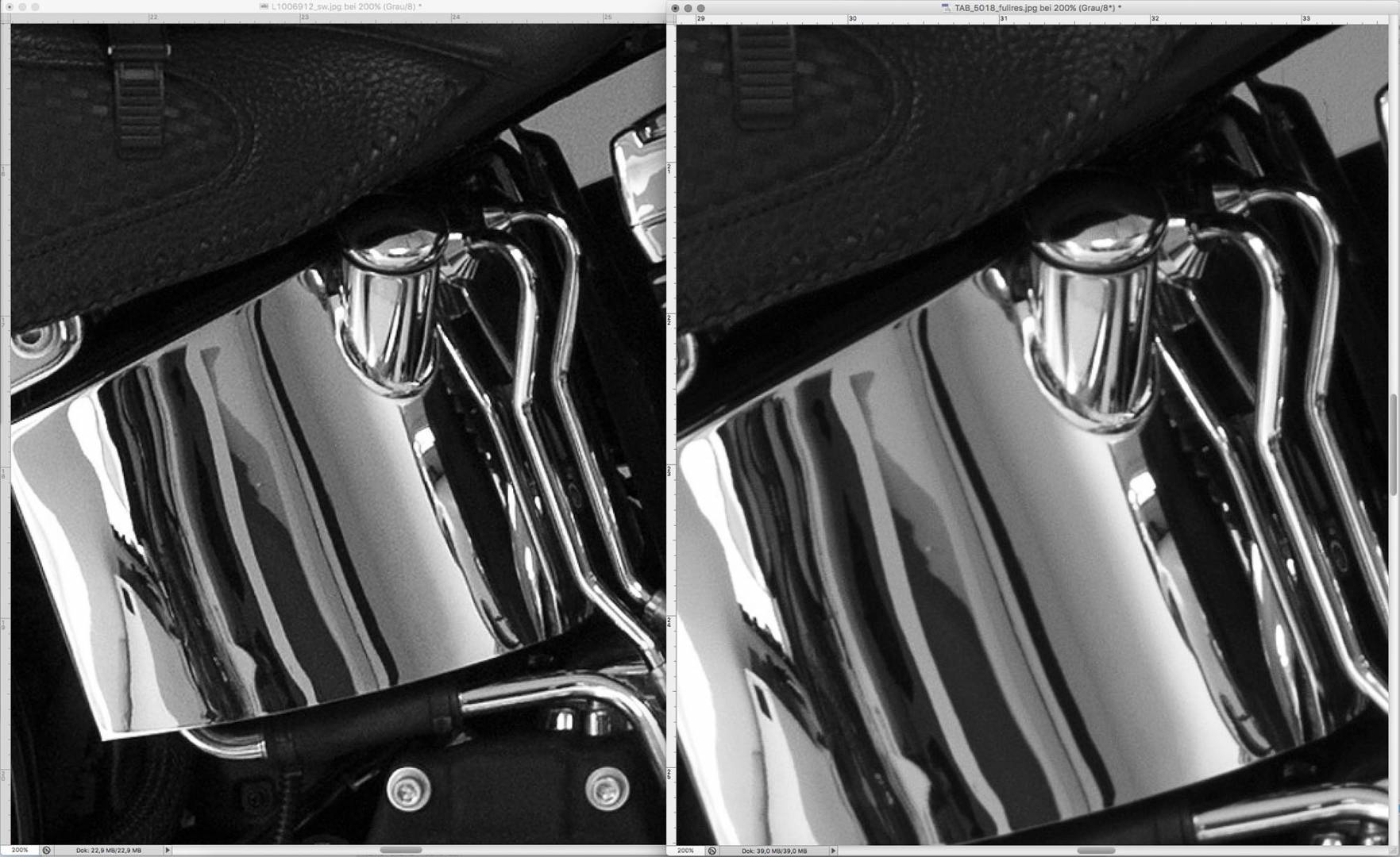
And, finally, a 200% enlargement with the M10P image in black and white on the left and the M10 monochrome picture on the right.
First of all: In my opinion, the differences between the respective black-and-white images from the M10-P and the M10 Monochrom are practically indistinguishable when you look at the overall picture. Apart from the larger representation at the same magnification scale due to the higher basic resolution of the monochrome sensor, no immediate differences can be discerned.
Only at higher levels of magnification do you really appreciate the distinguishing characteristics of the Monochrom. Because of the higher light sensitivity of the pixels due to the missing Bayer filter, the Monochrom at the same ISO setting (here ISO 800), has less noise, despite the higher pixel density, than the M10-P.
In addition, there is an overall softer and somewhat better-graded image with finer grayscale and a touch more drawing in the border areas.
Out and about with the M10-M
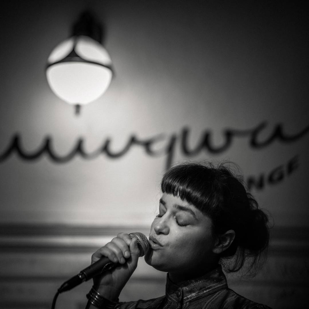
Finally, here are two photo series taken with the M10 Monochrom.
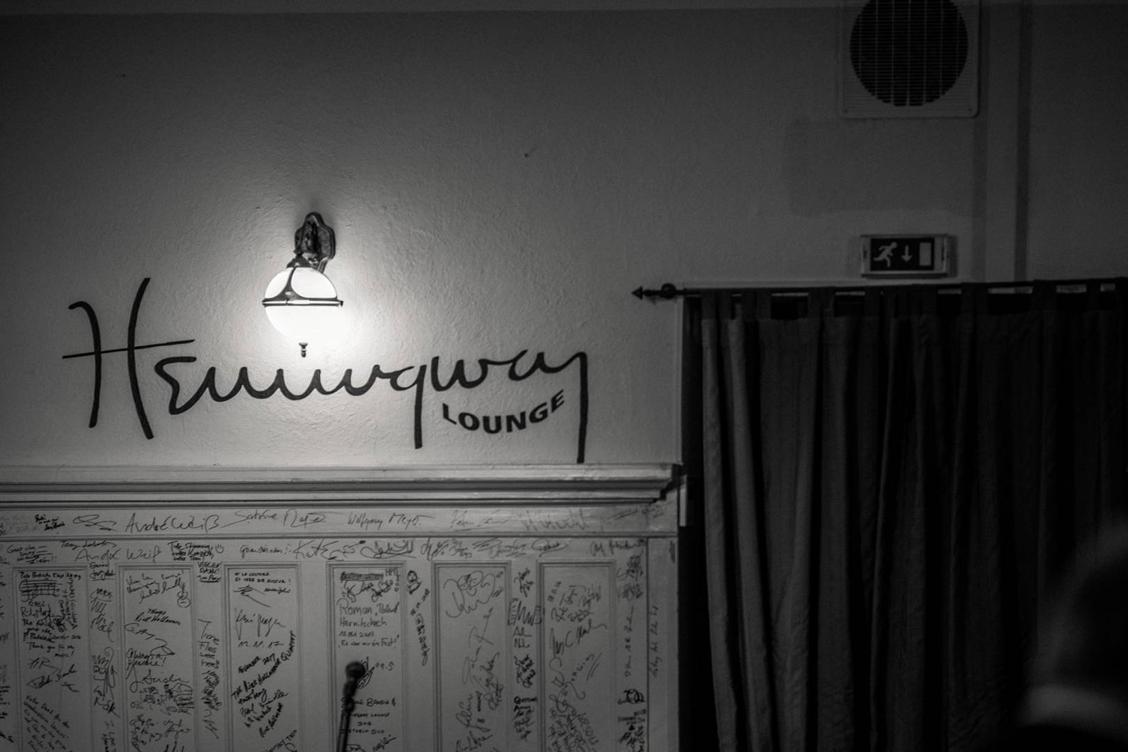
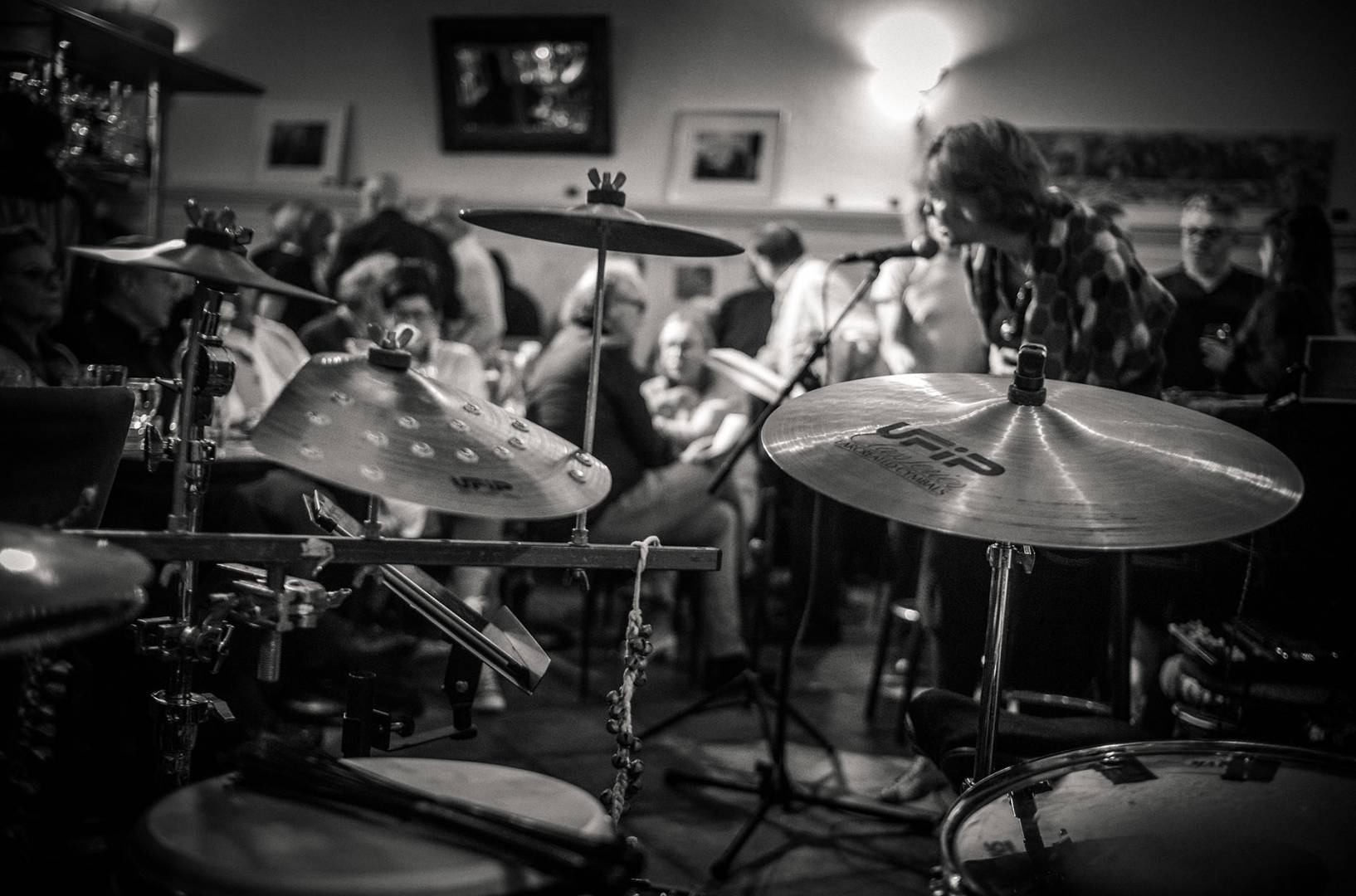
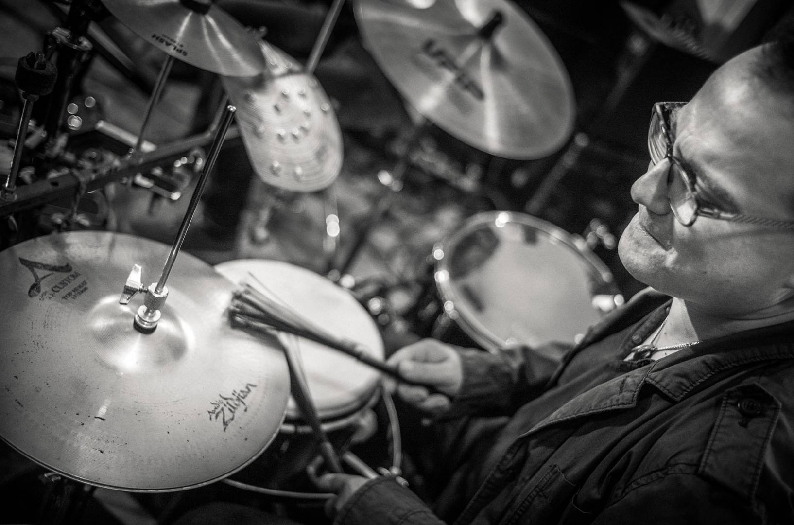
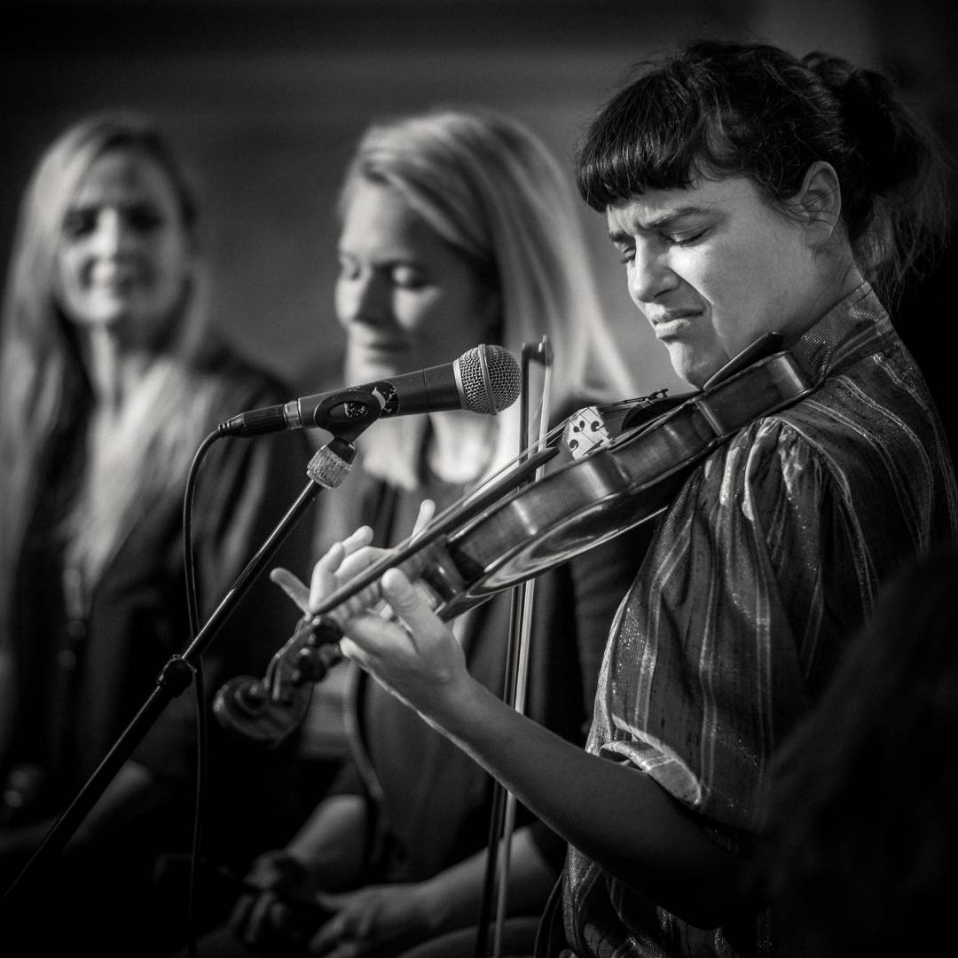
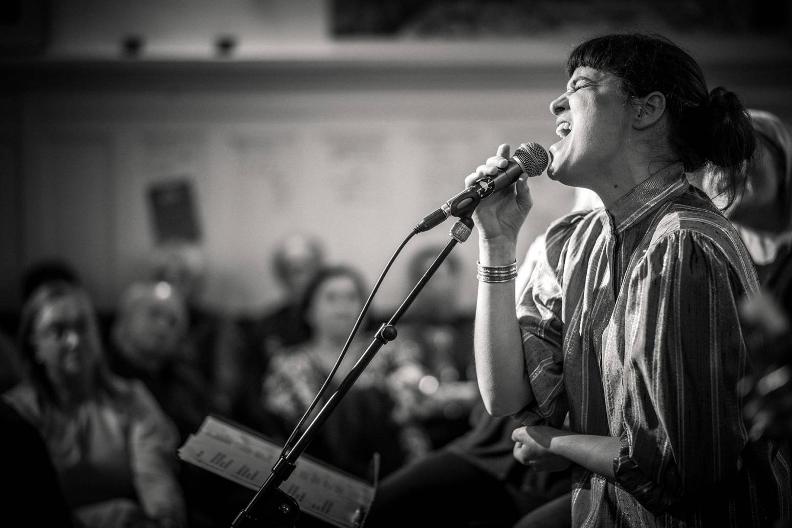
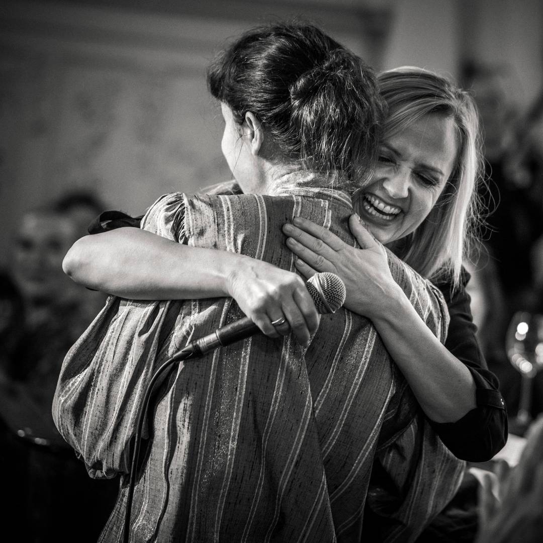
The first batch was captured at a concert under rather poor lighting conditions. Consequently, with high ISO settings, between 1200 and 6400. Here, the Monochrom shows its greatest strength in my view, namely in the very low and fine noise at the high ISO range.
Click on the images to enlarge
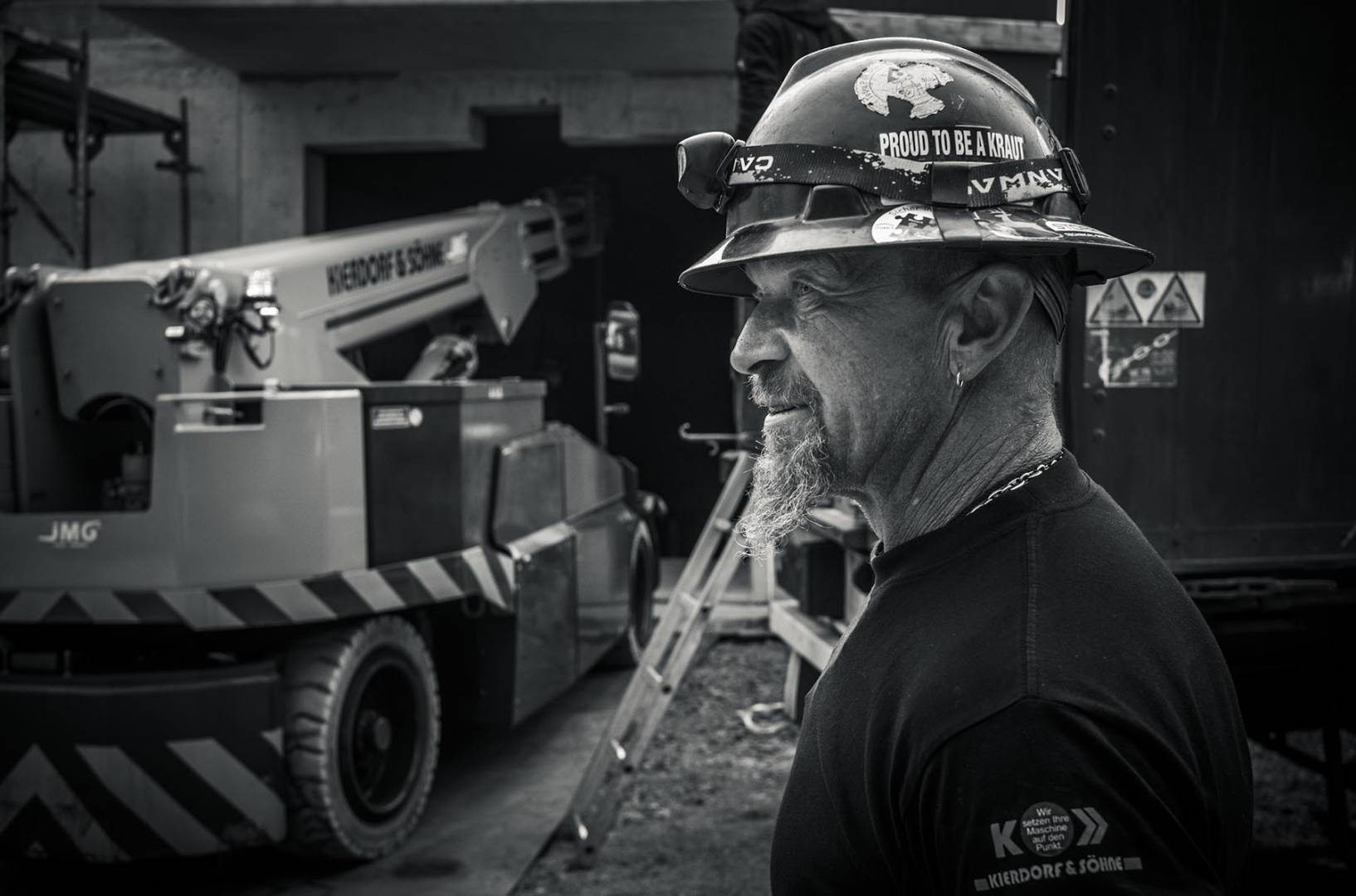
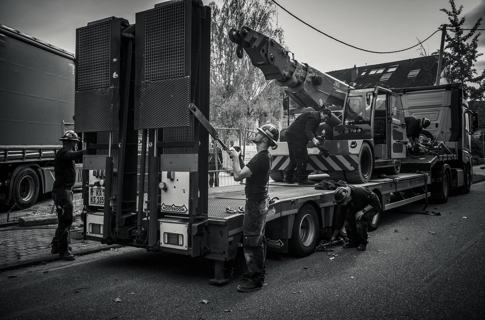
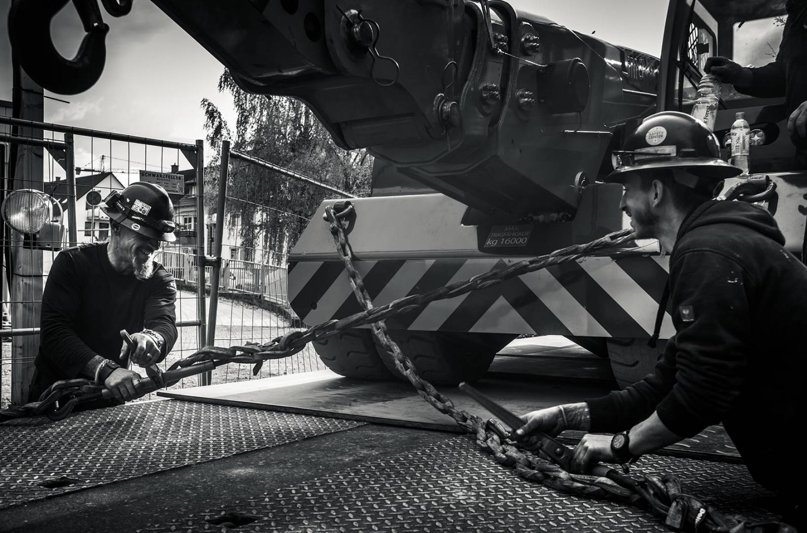
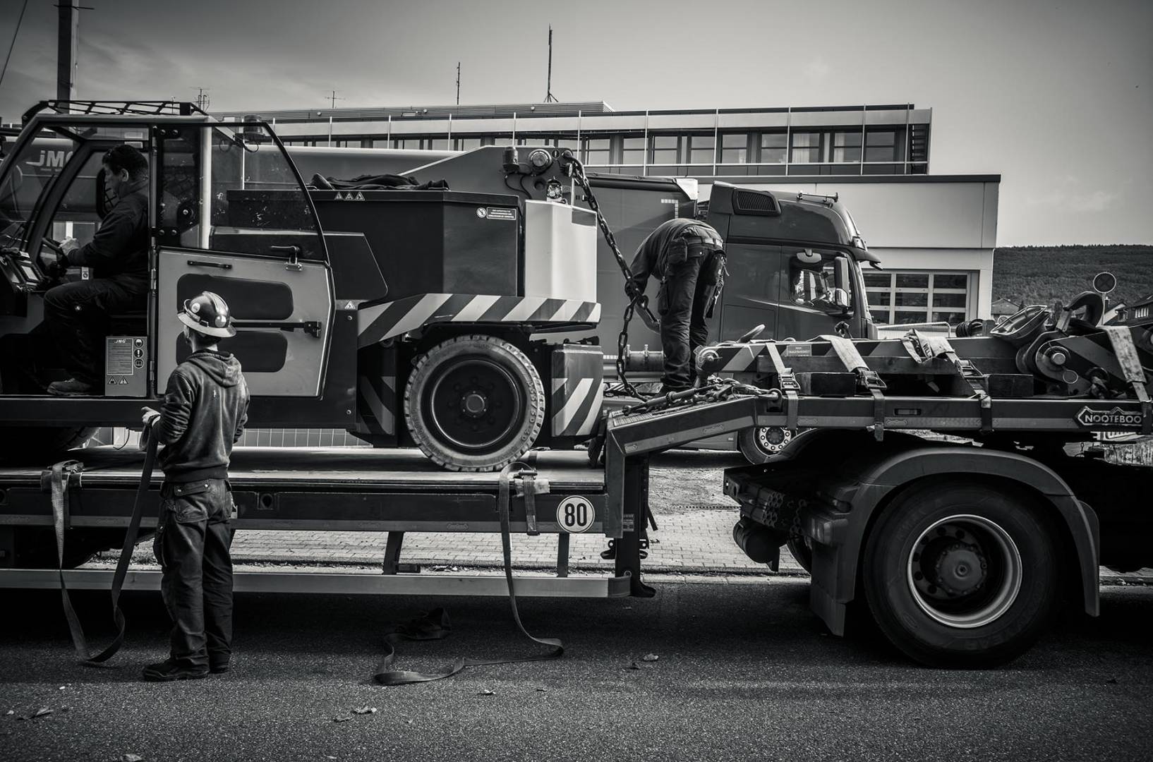
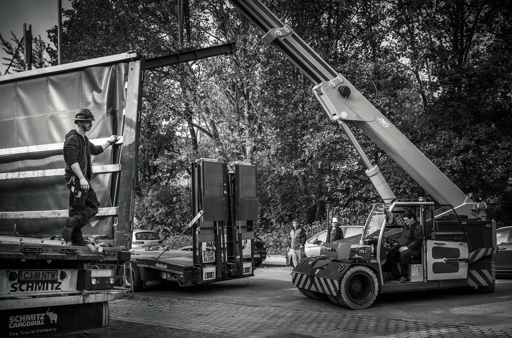
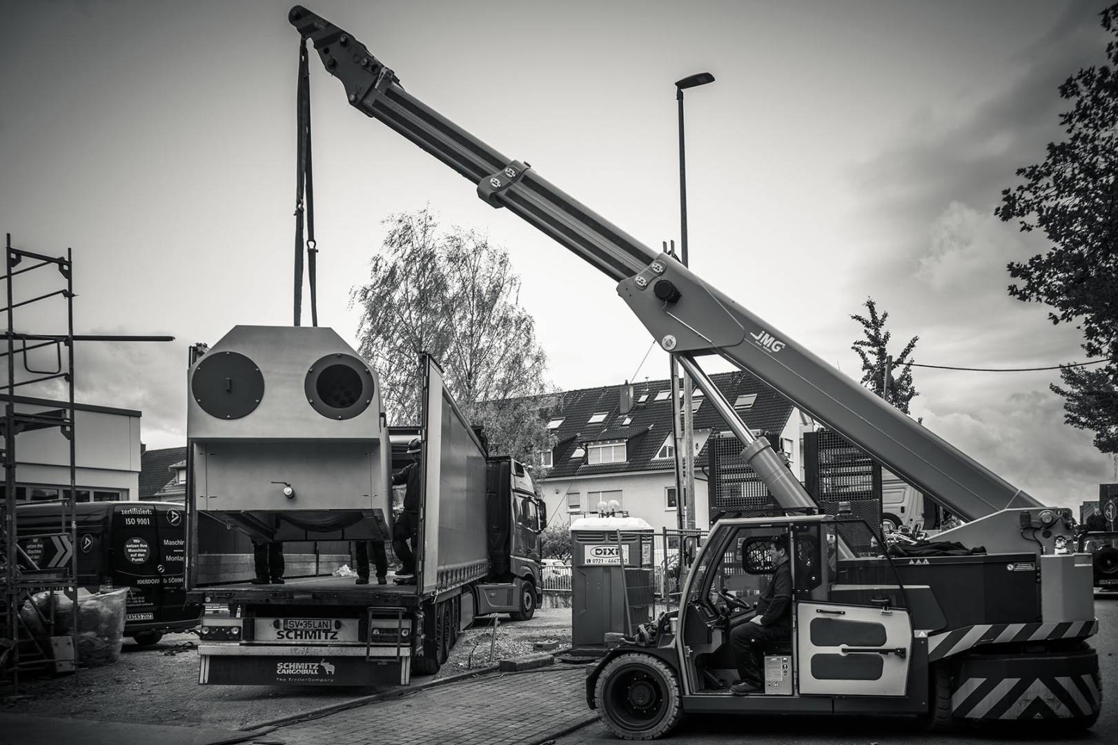
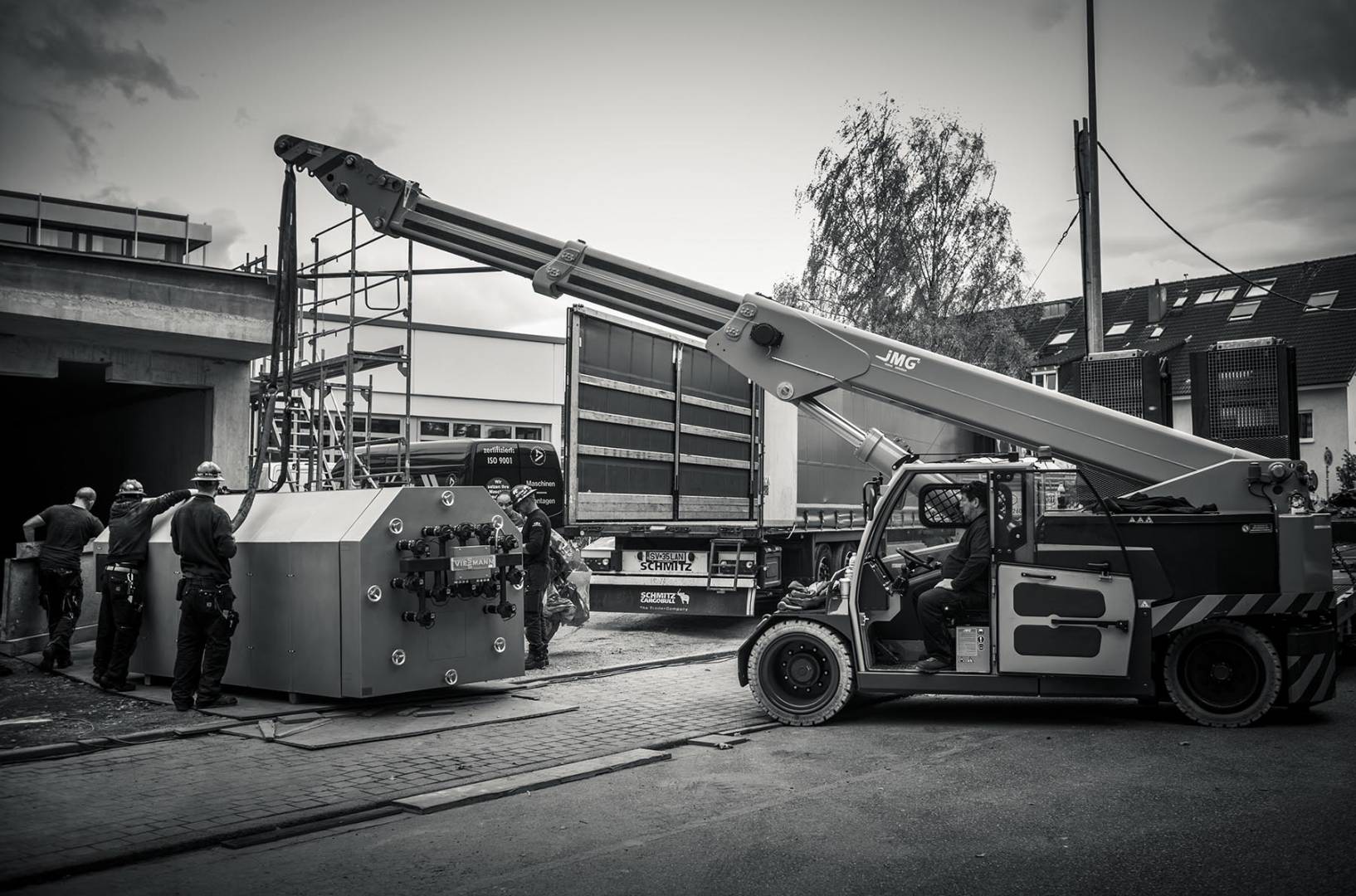
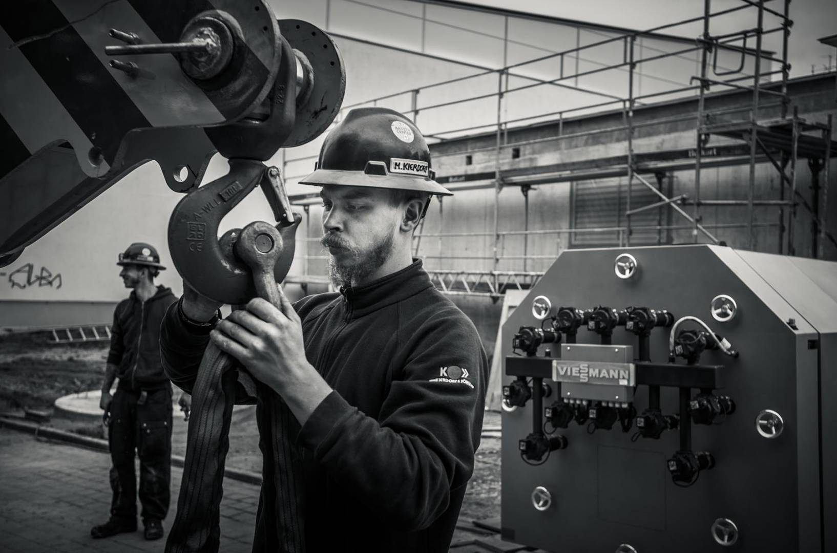
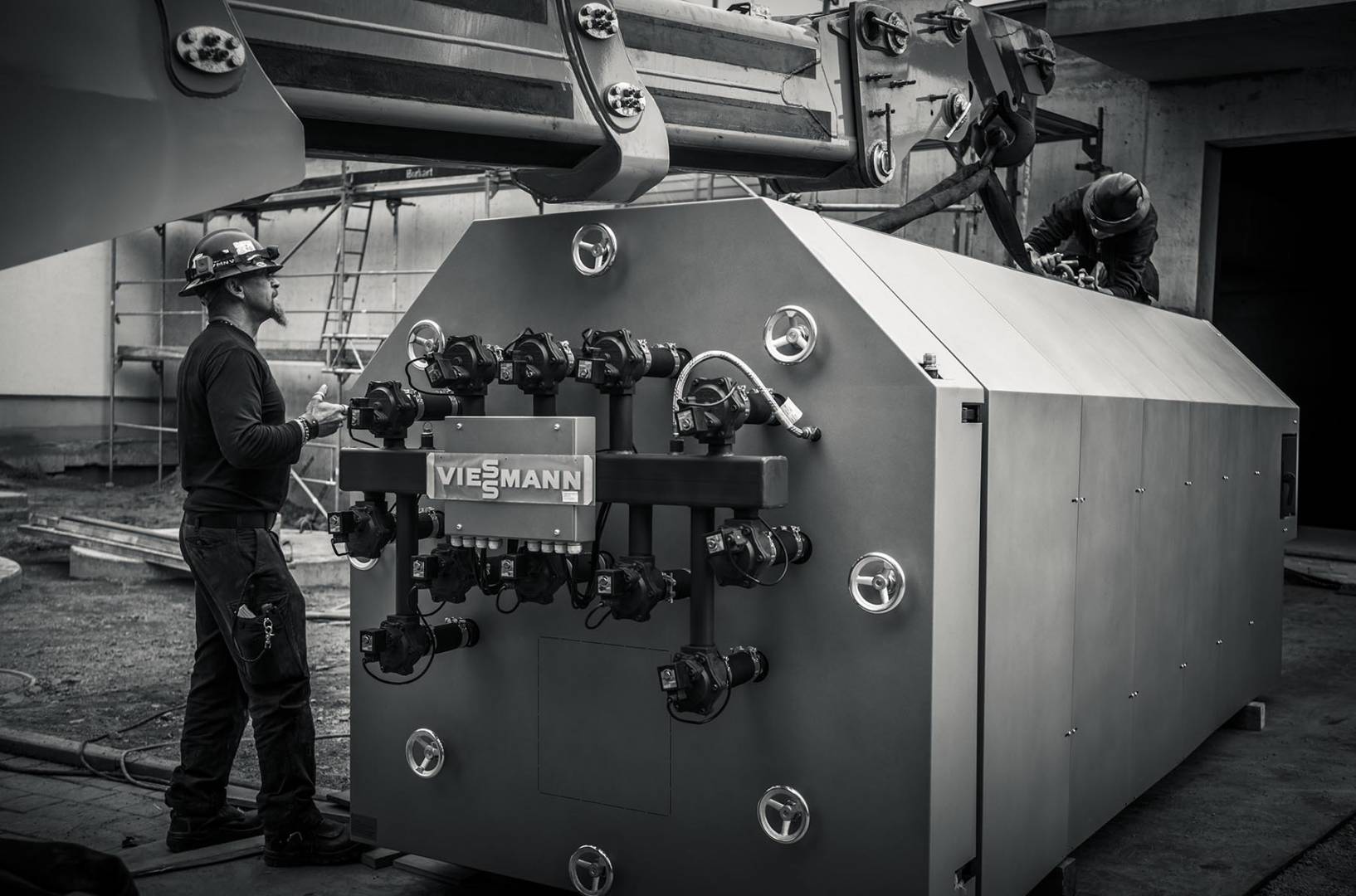
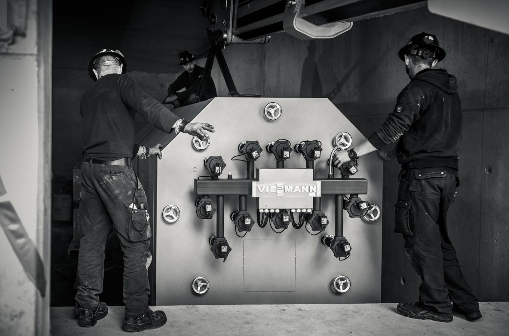
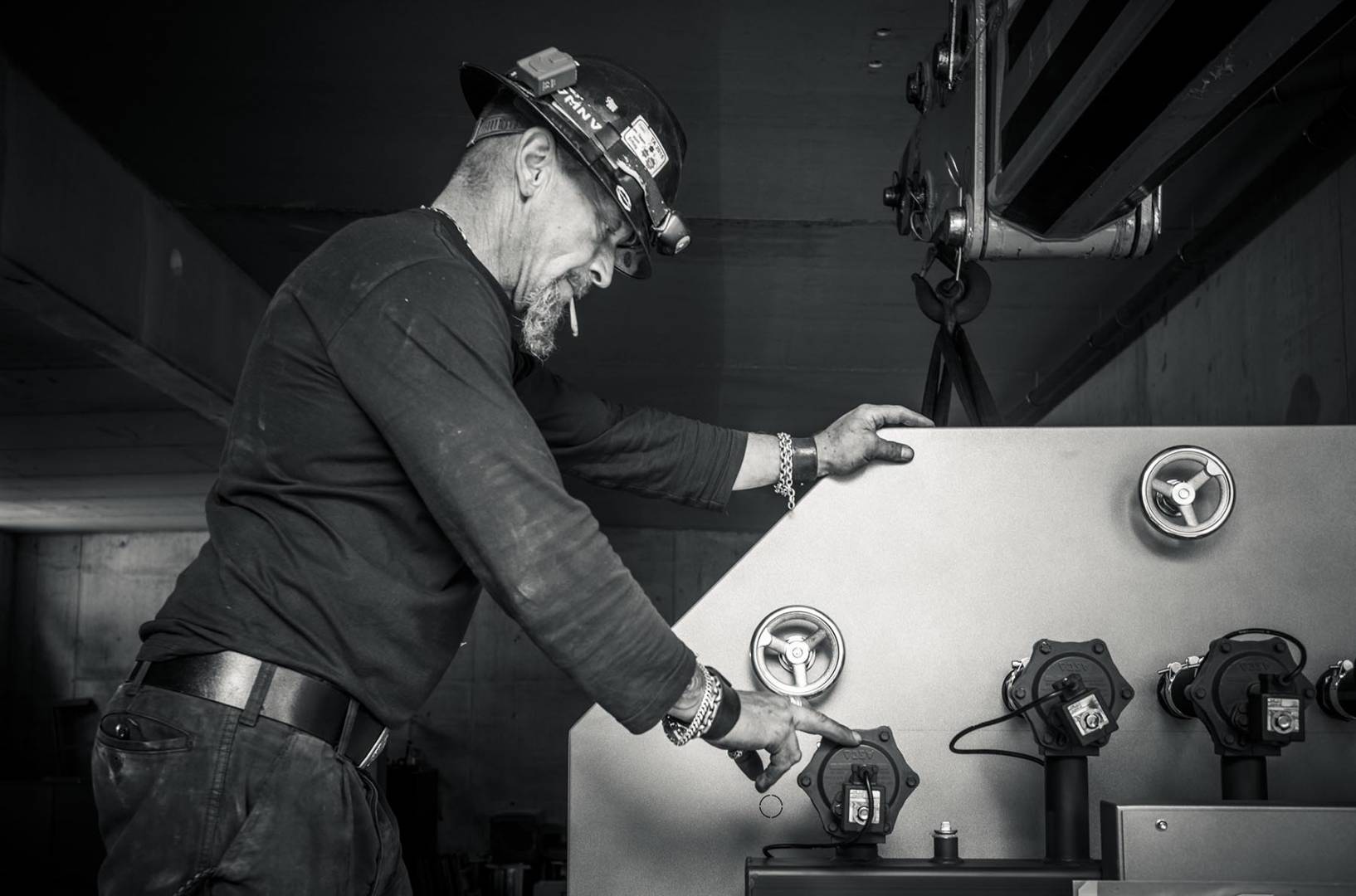
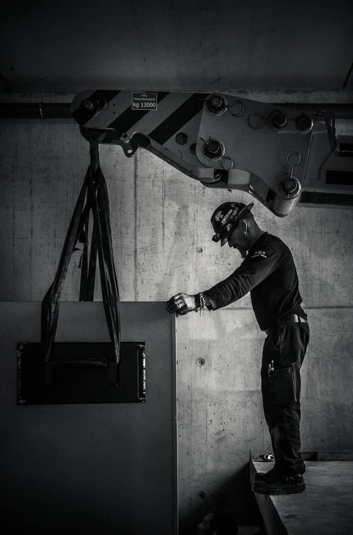
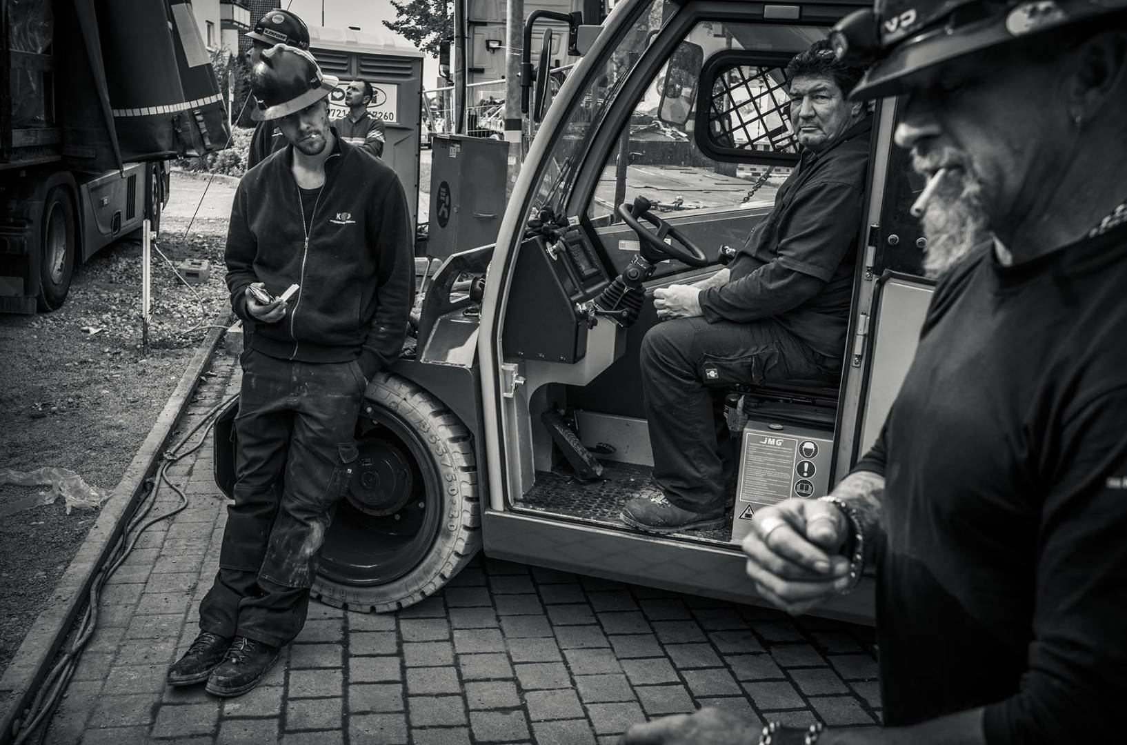
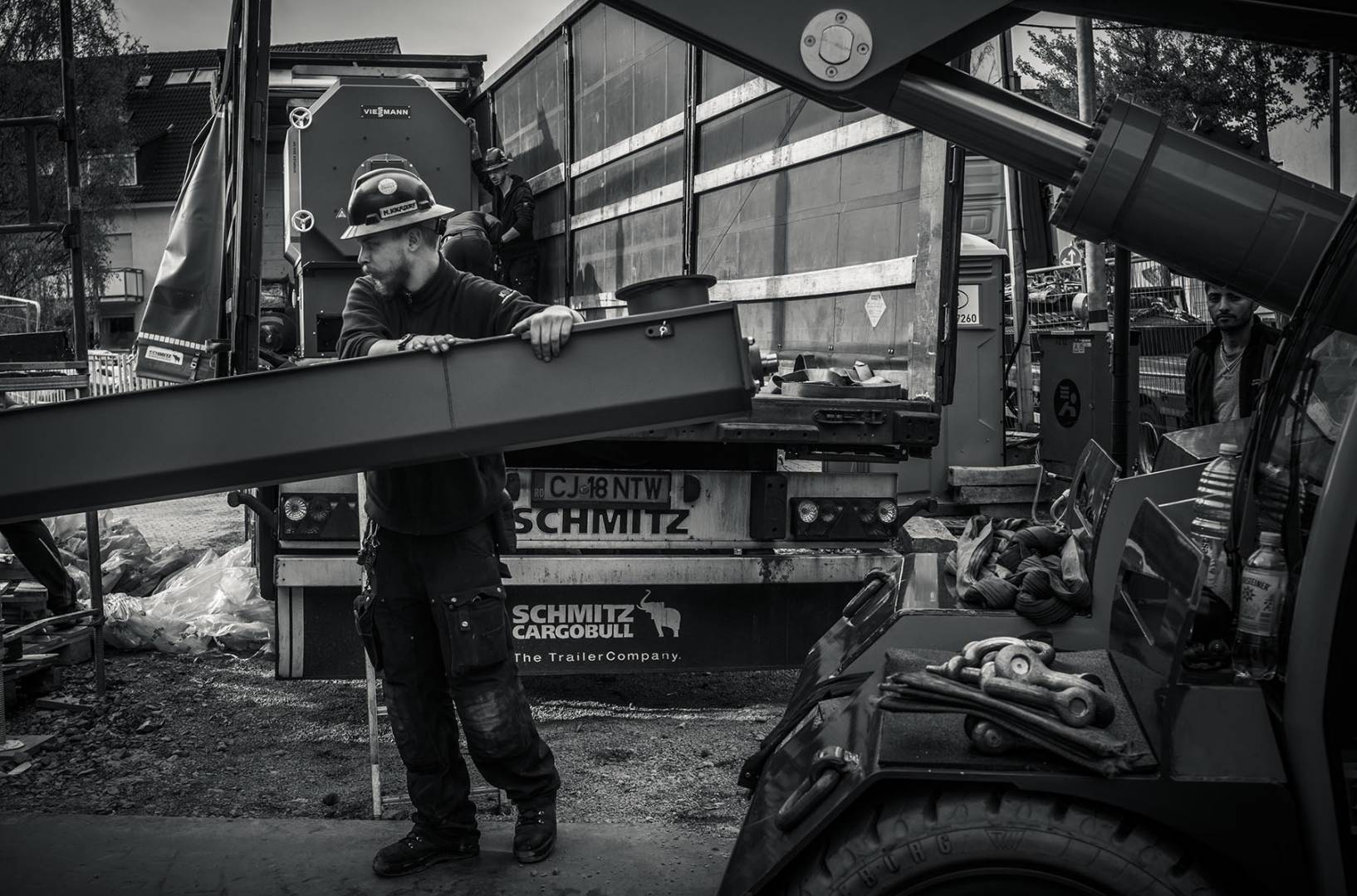
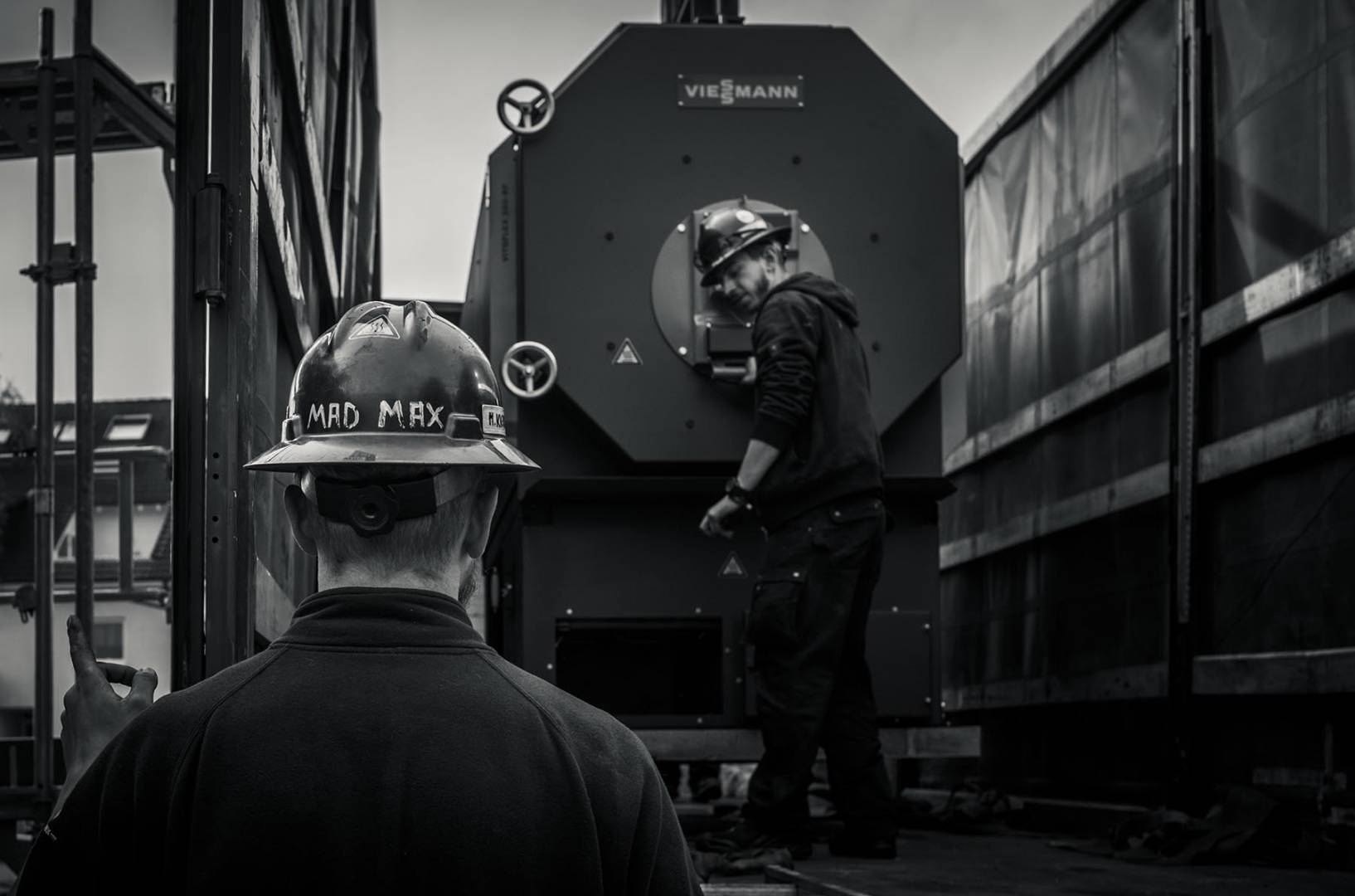
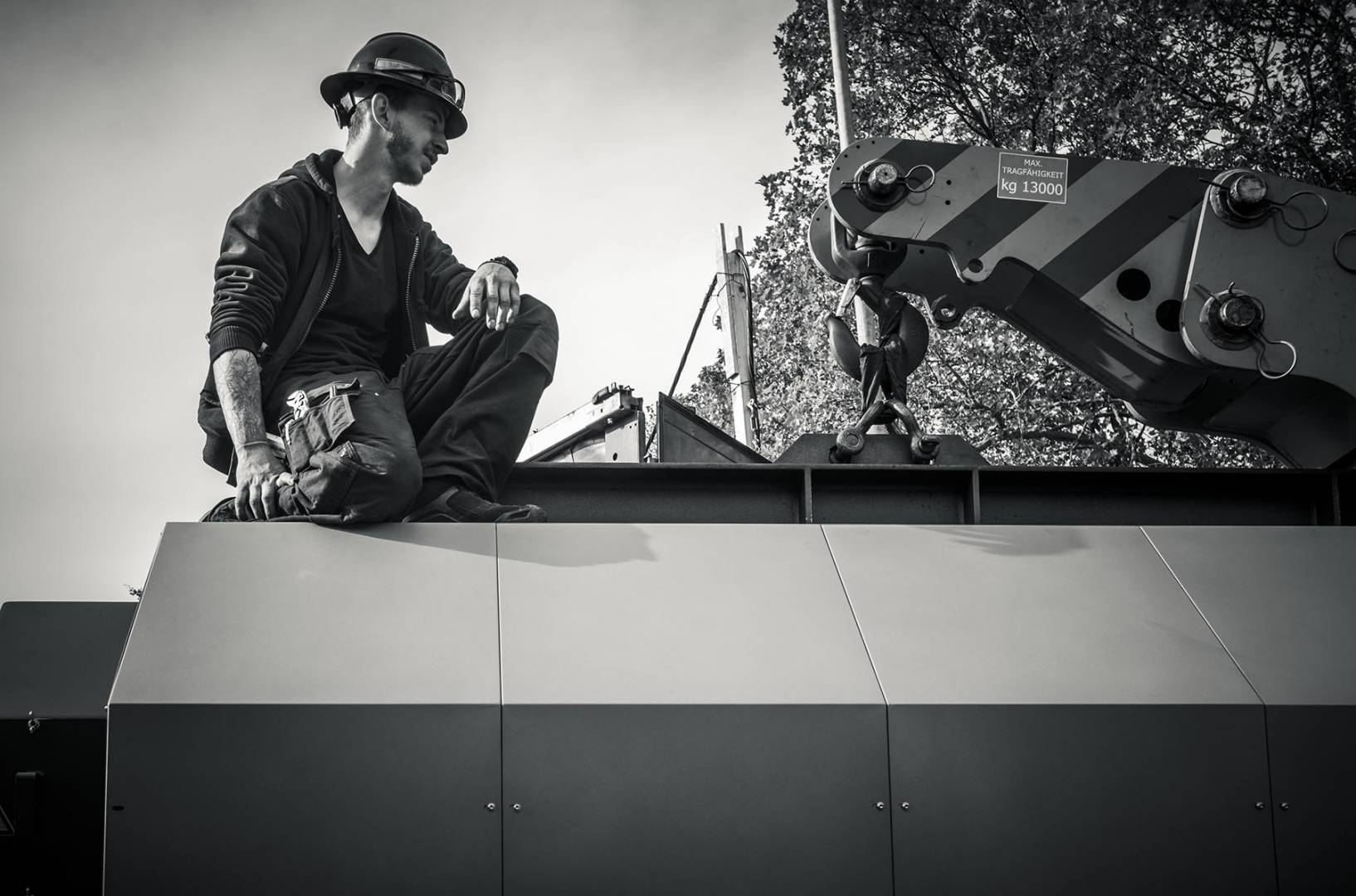
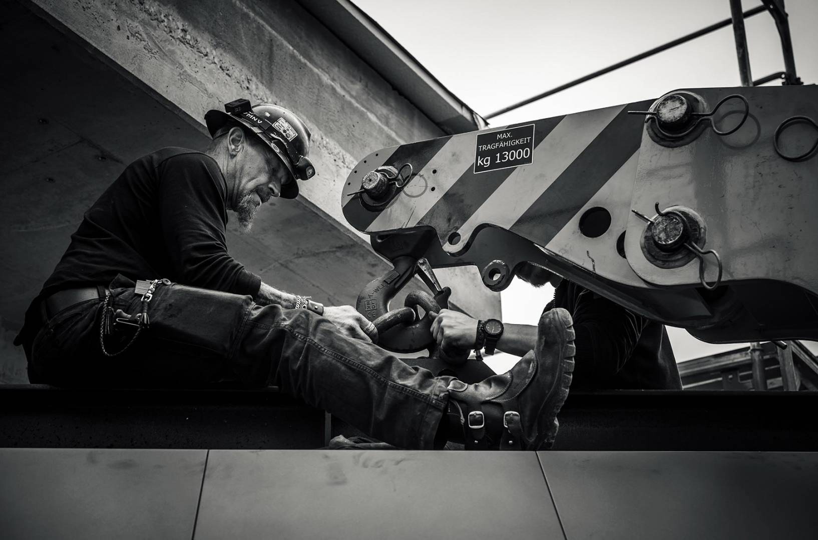
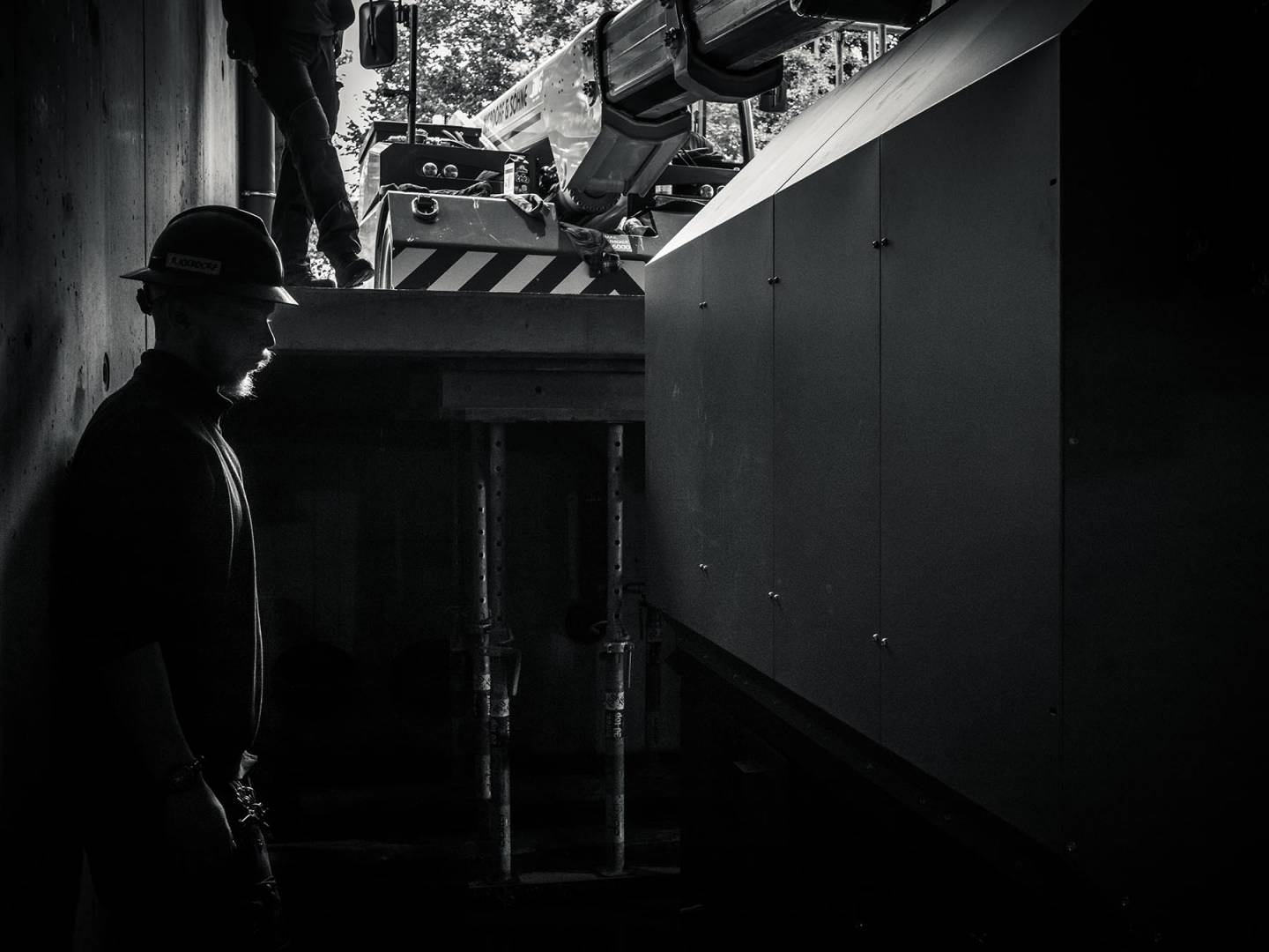
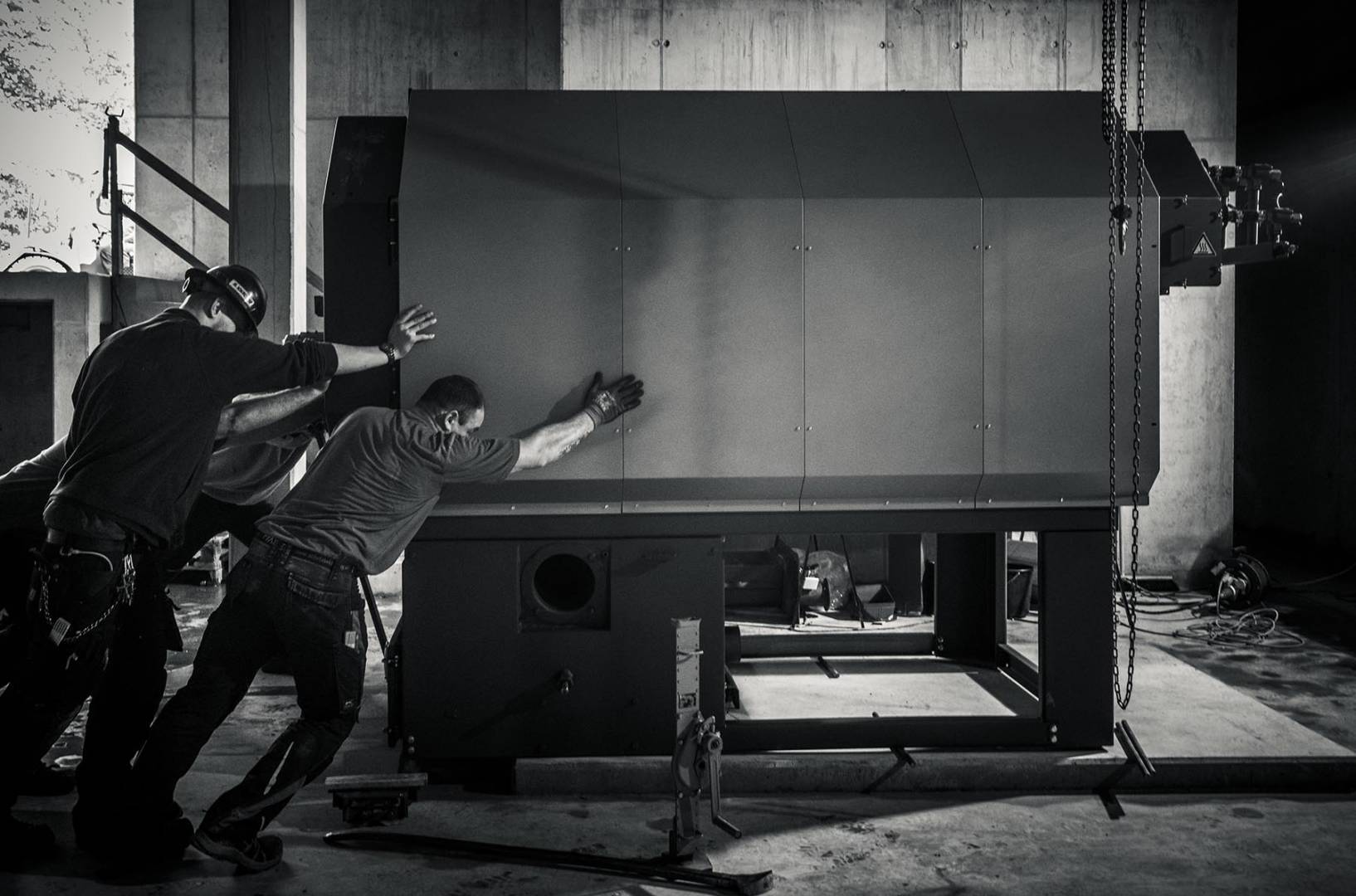
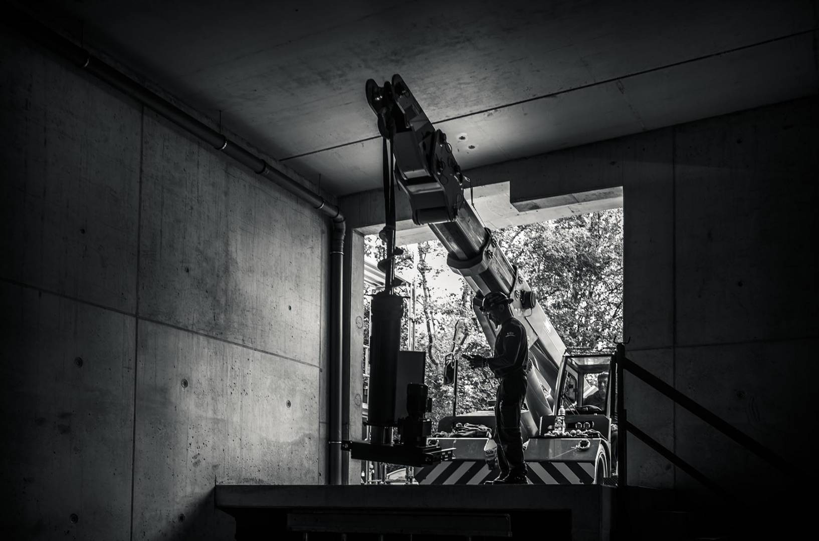
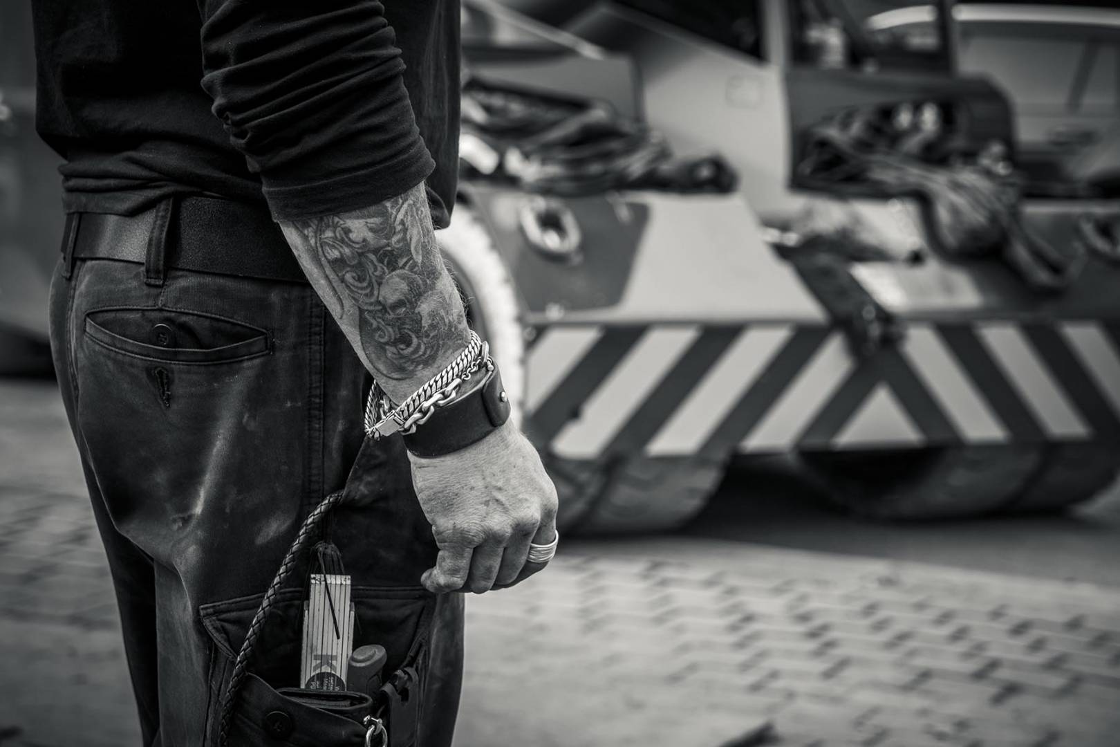
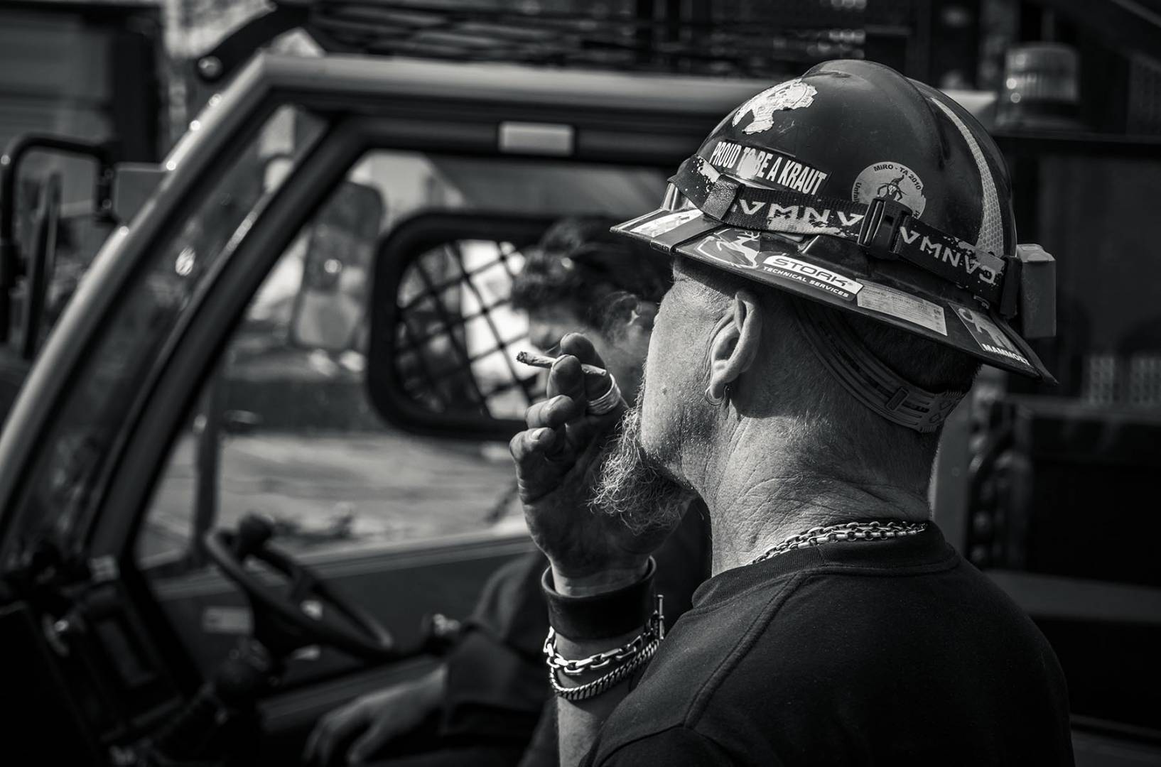
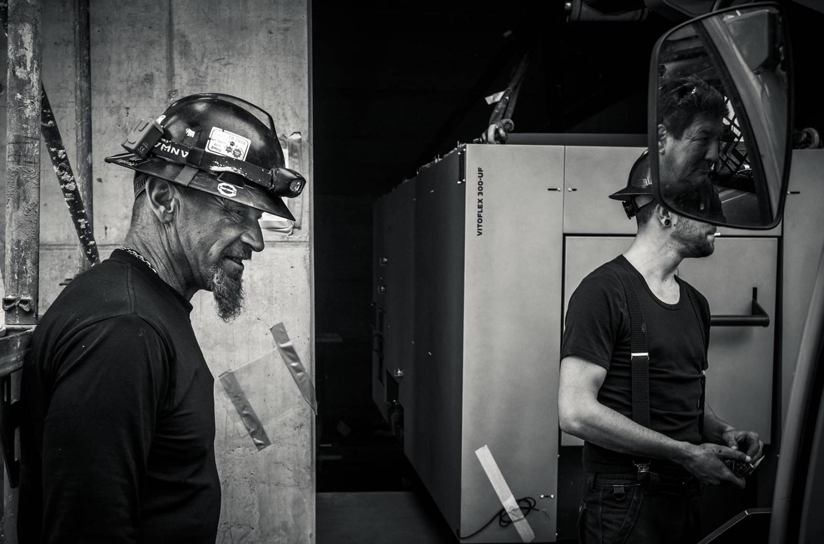
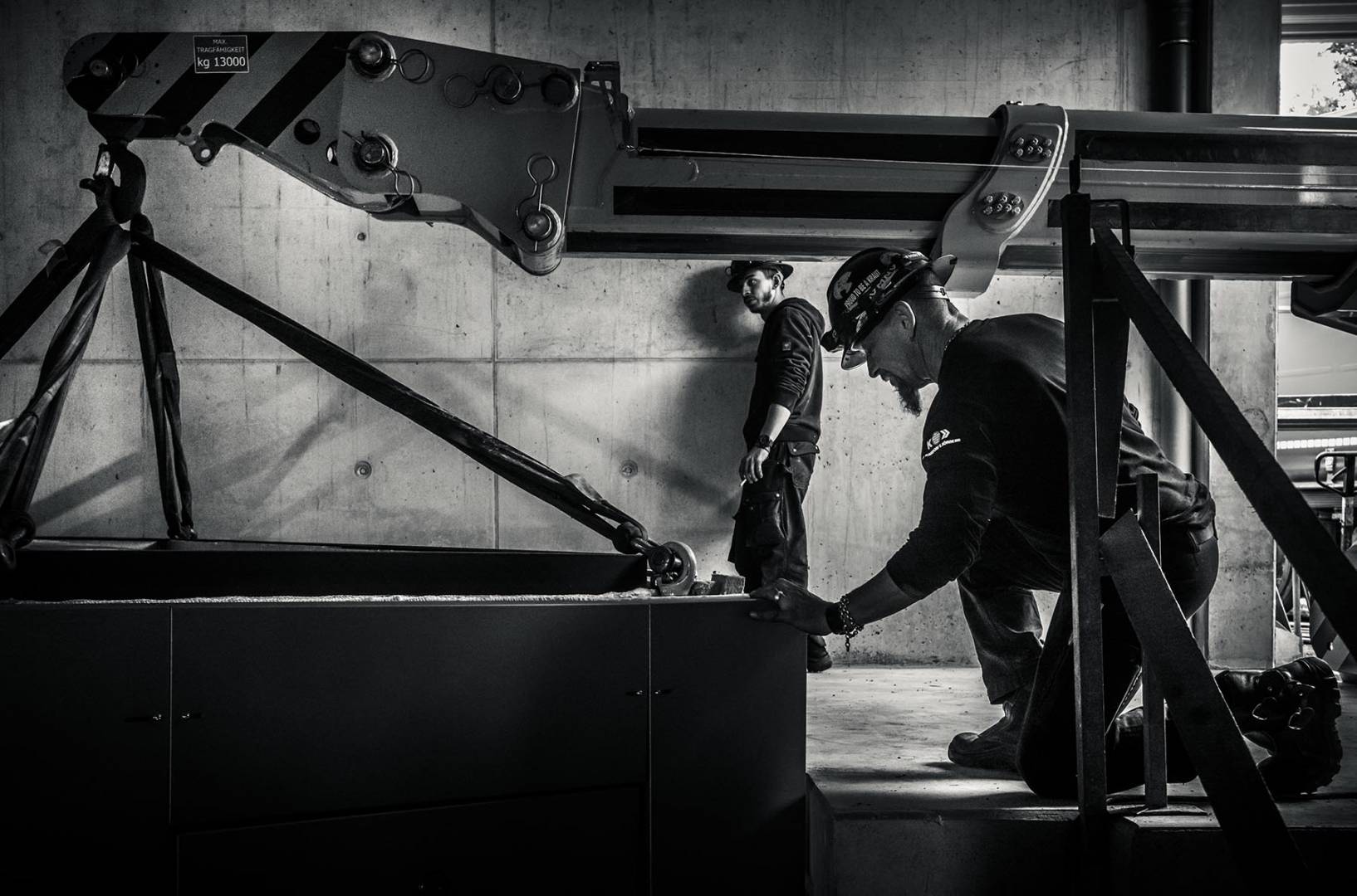
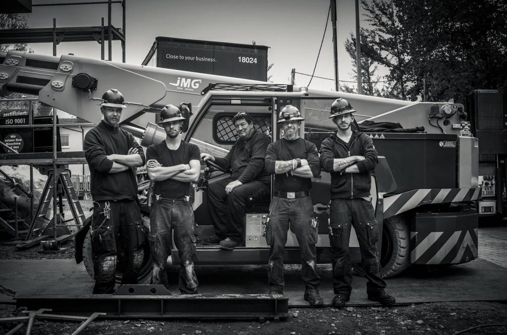
And, secondly, a series covering the theme of heavy haulage, featuring cool guys from a specialist company, that I shot in parallel with the SL as part of a job. Incidentally, the customer was enthusiastic and, in the end, also wanted some monochrome photos for his reference publication. This is something I had not anticipated. Again, click on the images to enlarge.











Wonderful, thomas!
I can only dream of how it must feel to be handed an M10-M and told “Here, please go and test this for us”!
To me, the Mono looks less noisy than the M10 in the crop, despite the higher resolution. The files have a smooth depth and richness to them that i really like. Would i opt for one over the M10, which also looks to produce beautiful monochrome shots? Its an academic question in many ways, because they’re both well outside my pay scale, but the answer is “I’m not sure”. At 10-10th’s and in great lighting, i’m sure the Monocrom is something unique. But i may just value the versatility of the 10-P too much. Ironically though, i lean towards the less versatile M10-D , lol. I do love niche cameras though……
All that said, my continual ponderings regarding Leica’s are whether i should take a plunge on an M8 – the original “poor mans Monocrom”. That’s more in my price bracket.
Thanks so much for the article. I think my favourite shot is the rear view of “Mad Max” helmet, i just love the depth of field falloff and pop.
Jason.
Leica never heard of Lightroom?
Thank you for the review.
It matches my tests with a production model M10M with Elmar 28, compared to Sigma DPM3 and M240 90APO-SCR.
Better dynamic range, better iso, great camera. What I could not find was a relevant impact on resolution, even though I’m sure it must be there. I had not enough time and possibility with the M10M to try other lenses the could bring out this additional capability.
My take:
– 1 stop more difficult to hit focus, compared to a M240/M10P/SigmaDPM3, but higher iso/gain stability compensates for that.
– 2-3 stops higher iso capability depending on what you compare it with.
– 1-2 steps larger dynamic range, shades
– no relevant difference on the BAYER effect re textures compared to M240, clearly falling behind the Sigma Foveon’s capability on crispy popping textures in BW or Colour, regardless. But hey, the Sigma can do only that, it’s an ultra-niche compared to the M Monochrome, even.
– I can only assume that this high resolution sensor requires newest generation large size lenses as one has on the SL range, or Noctilux or newest APO/Summilux to come out in a relevant improved picture.
To whom?
– not standard street photography (waste of money, unless “WANT” factor)
– nature, studio, wide dynamic, shades useage
– who has invested in very recent generation top end glass (the big light collector lens)
– not me.
A splendid series of images, Thomas, which realise the capabilities of the camera to perfection. These are wonderfully detailed images and show off the high dynamic range ability particularly well.Not much requirement to take series of exposure brackets with this camera I think? To me the HDR aspect is wholly complimentary, showing great ability to cope with detailed tones through extremes of contrast. Of course, the camera didn’t take the images, so well done, Thomas , for your skills in illustrating what the camera can do so well.A great article with super black and white images, thank you.
“if a picture is interesting, nobody cares if it’s technically good . . and if it isn’t interesting, then nobody cares at all”. This says it all, Jono. Discussing whether one camera or another produces better pictures is a complete waste of time as great photos are made by photographers and not by cameras. My favourite photograph above is No 36 of 49 and the reason why I like it relates to the composition. It does not matter what camera was used to take this, whether it was in colour or black and white, whether it was digital or film or whether it was a Leica or a Box Brownie.
Do we really care about what brushes Leonardo, Michelangelo or Rembrandt used? Would using the same brushes make us paint like any of them?
William
Hi William
Quite right BUT it’s rather good fun comparing results from different cameras, and after all, there isn’t any harm in having the best tool (as a painter with brushes or a chef with saucepans and knives).
I’m also interested in how much one has to think about the camera when one should be thinking about the image – and I do feel it’s easier to take good images with a camera which isn’t in the way (why I’ve just sold my Fuji kit in fact).
But I think of it as a completely different exercise – testing cameras and taking photographs that is.
best
Jono
I agree that the camera should not get in the way. Mastery of photographic techniques should ensure that an experienced photographer should be able to pick up any camera and start getting satisfactory results straight away. I rarely read camera manuals apart from, if necessary, finding out about where the various basic controls for photography are eg, loading, ‘film’ speed, shutter speed, aperture etc. We have ruined photography with digital menus, digital processing etc. I am never interested in what camera/lens a photographer used, but rather I am interested in the results. I am sure that no reader here wants to know what oven, pot or spoon the chef used the next time they have a nice meal in a restaurant. Some people might want to know about the ingredients and the cooking temperatures and time, but, for me, simple soul that I am, the proof of the pudding is in the eating.
William
Perhaps it is just me Thomas, but the pure monochrome shots have a just a shade more tonality, and dynamic range – well that is how they appear to me anyway. Its in those chromes and the reds of the motorbike, there is a just a deeper layer in the image.
Thank you for sharing, I enjoyed this, and seeing the world of a camera tester.
Hi There Thomas
I hope you’re flourishing (have you ordered an M10M). I’m still holding my prototype (03 of 15) hostage, but I fear a call to return it at any time!
What a great write-up I really enjoyed it, and the pictures are pertinent and revealing. But they all refer me back to my oft stated mantra “if a picture is interesting, nobody cares if it’s technically good . . and if it isn’t interesting, then nobody cares at all”.
You can make cracking A1 prints with black and white conversions from an M10, and even printed really big I doubt that most people would notice the difference between it and the M10M . . . without standing really close and peering at the detail.
On the other hand it’s deeply seductive (the detail) and shooting with a monochrome only camera has a really interesting effect on one’s attitude.
Anyway – I’m rambling – great article – thank you.
all the best
Thank you for doing this review. You have increased my enthusiasm to get one. Luckily the camera will probably be readily in stock by the time I figure out how to afford one.
Well I must head out an buy a ski mask.
Best comment!
David: I generally develop my DNGs in the Photoshop RAW converter, so it has nothing to do with iphoto 😉 … All photos are made with Summicron M 35mm Asph. and Summicron 90mm Non-Asph. (last version) And the question of whether color or black and white is – imho – a question of personal taste. I photographed the “heavy payload” series in parallel with the Leica SL and also showed the color versions in some other publications – almost everyone says that they like the black and white photos better 😉 … and please excuse my english, all reviews are translated from Mike 😀 …
Danke Schön, Thomas. Ja, ich habe gesehen – yes, I saw – “Lenses used: Leica 35mm Summicron-M ASPH and 90mm Summicron-M non-aspherical (previous version)”, but it was a bit of a guess as to which were used for which photos ..and which pictures might have been cropped from the other lens).
But please don’t take offence: it’s just me ..es ist nür mich (oder ich) ..I’m sure that many other people will LOVE them! ..But I just don’t understand WHY one would take these pictures in b&w ..photos of death and destruction; yes, possibly ..graphic photos of some desperate event; yes, possibly ..pictures of old buildings; yes, possibly ..but low-light music club singers, and bright, cheerful, construction workers..? ..I just think that colour would show the differences between the humans and the machinery so much better. The Monochrom just makes them look so grim ..”grimmig”, oder “finster”.
– But what do I know? ..it’s all just a matter of personal preference, and für mich – for me – I would just love to see these particular pictures in colour ..that’s all ..das ist Alles! Tchüß!
I suppose, David, the salient point is that this is a review of a monochrome camera. It would be rather strange if the pictures were in colour. I don’t want to put words into Thomas’s mouth, but he does have colour versions (from the SL) and, I suppose, a future comparison might be in order.
I dunno; the M10-P b-&-w photos just look more “punchy” to me, whereas there seems to be a – to me, anyway – rather horrible ‘HDR’ appearance to the M10-M photos ..but I supposes that’s just in the chosen processing which Thomas has used.
There seem to be too many ‘intermediate’ tones, in the faces in particular, but maybe that just rings “wrong” for me, brought up on Verichrome Pan, Panatomic-X, Tri-X, HP-whatever, XP-2 and so forth.
The same’s true for Jono’s pictures, which is why I said that maybe photos from the M10-M are perhaps a new style of b-&-w ..which is unrelated to film-based black-&-white.
I think – but maybe nobody else does – that these pics could do with a little more of the ‘definition’ slider in iPhoto, which would “crispen up” the edges of each change of density, so that things – for instance in that last photo of the workmen, above – don’t just blend into each other, but there’s a bit more differentiation between, say, people and their background. (Perhaps a “crispy” lens, like the 50mm APO, might have boosted the ‘crispiness’ slightly ..I think we don’t know which lens(es) Thomas used.
I understand the better performance that the ‘straight’ M10-P in low light – as there’s no absorbent filter array in front of the Monochrom sensor – but I still think “Why?” ..why would one want to shoot these pictures in black-&-white, when there’s obviously so much colour in these just screaming to get out!
Leaving aside the ‘colour screaming to get out’ remark (fine – Emma would absolutely subscribe, but not relevant now).
The HDR appearance though (which my photos are also guilty of) is to do with the really big expanded dynamic range of the Monochrom, and I think it is startling, and nothing remotely to do with film either (which always had a much more circumscribed dynamic range).
So it’s HDR indeed – High Dynamic Range – you can easily get rid of it . . . (with the definition slider or it’s equivalent in Lightroom or Photoshop) . . but you can’t make it, and I guess that Thomas made the same decision I did in the pictures – to retain it to show the possibilities with the camera.
All the best
Jono
Mmm, yes ..I didn’t really want to mention it, but ..er, Emma and I do have this, er – how shall I put it? – “understanding”.. 😌😉
haha – as you’ve said before David 🙂
Mmm ..d’you know what I think this camera’s good for? Things which are already fairly monochrome.
I think this’d be great for pictures of (1) misty mornings; mist settling on meadows, or above a wintry lake (especially with that older rigid 1957 50mm f2 which Thomas shows, or with an old-ish Nikon or Minolta lens [adaptors are available] which are all great at giving very fine mid-tones) ..that’d really show the scope of this camera’s finely-detailed greys; (2) cement or concrete-faced, or weathered buildings, like London’s Royal National Theatre, or old barns, to capture the textures and different shades of the building. If looking for somewhere similar in Germany – where Thomas lives – I’m thinking of the concrete slabs of the Holocaust Memorial in Berlin, where the finely detailed greys, which the M10M obviously delivers, would remind us, too, of the fine grey smoke and ash we were all thinking of just a few days ago on 27th January; (3) a sandy shoreline (nothing to do with the barefoot pop singer!) where the texture of the virtually monotone sand could be delivered in really fine detail, along with the white splash of an incoming wave, and perhaps the dark twists of seaweed along the high-water debris line. The M10M would be ideal for a photo like that ..in which colours are naturally almost absent; (4) looking through a brightly-lit pavement café’s frontage into the darker gloom within: showing how the camera copes with harsh, bright light and crisp deep external shadows, along with the subtler light inside; (5) ..and, maybe using the old rigid ‘dual-range’ Summicron, close-ups of such things as a clutch of chickens’ eggs, showing the shapes, the textures, the light and shade which give them their 3-D ‘volume’.
All those photo themes are pretty much monotonal, or even colourless, so nothing would be LOST by using the M10M in those circumstances, and those pictures would surely show its strengths – it’d be in its natural habitat, so to speak, instead of using it to just remove colour from a colourful scene.
Used simply for snapping something full of colour – but removing that colour, and rendering it grey – is, to me, like writing the text of a camera review, and then removing every second line (leaving the text not making proper sense) but also forcing into every remaining line every letter of the alphabet (just like having every hint of greys which the camera can provide when and if wanted, there, visibly, in every single photo).
So my take-away from this is that the M10M is great for monotonal – and particularly for textural – things which are already pretty much monotonal (mist, cement, concrete, sand, scrubland, asphalt roads, rubble roads, white sheets hanging on a washing line, snow and winter scenes, and maybe for Guy Fawkes’ bonfire night, but it’d be silly to use for the Notting Hill or Rio Carnival, or for the Red Carpet at Cannes, or for general bright and vivid seaside shots.
Why lose colour? ..I’d use the M10M, instead, to accentuate contrasts, texture, fine greys, mists or existing monotonal environments. That, I think, is its purpose. And those kinds of photos, I think, would bring out and show its real strengths and capabilities.
Excellent point, and I prefer “longscale” B&W images anyway…easy as you say to shorten the gradation.
Denn, thank you for taking the trouble to respond to this relatively old article. It’s nice to see that our stories are still being read and appreciated.
Mike Evans | Editor
Hi Mike,
I’ve been a devout (passionate) fan of B&W photography all my life. In the film days I used PMK developer and took great pains with film development. Over the decades (a long time ago) I noticed that Ilford made their B&W films with higher acutance, by making the emulsion thinner (to save on silver), however the gradation always lost beauty with each step of the way. For example in this respect Ilford’s F.P.3 was far superior to FP4, and modern FP4 is different again. Back in 1960’s there was a lot of debate about chalk and charcoal (punchy) versus longscale fuddyduddies but needless to say, marketing resolution and the accountants won. An extreme example of this (glorious) extinct thick silver emulsion was Kodak’s Royal Pan. It was called Royal Pan for a reason, 3 layers of silver to respond to the light’s sensitivity optimally for beauty in rendered gradation. Those were the days. Contemporary B&W film enthusiasts would go delirious if such an emulsion was recreated 🙂 I never used it, far too expensive for a lad, and I was too late onto the scene, but one can only imagine/dream of the glories possible of 10×8″ Royal Pan in a tanning developer 😀 Okay, so why rabbit on about it, now? Well the M10-M raw files are somewhat like those earlier never to return silver rich films (but with the acutance) and three cheers to Leica for staring down those accountants 🙂
What is needed perhaps, to give all its glory (I suspect) is careful “development” in post. Straight out of the cam it’s like being developed in “D76 metol”, very good for certain contrast scale scenes, but aesthetically meh for (most) others. That was always the inherent problem with roll film by the way, different scenes needed different exposure/development, so you had to compromise. While the aficionados/perfectionists used the sheet film cameras and zone exposure development techniques. The old adage of: “develop the negative with precision and print with passion” applies. The M10-M gives you that opportunity for capturing the image with that Ansel
Adams precision, so that if you want, you can exploit the longscale richness therein because it at least has it to give to you. That is why untutored, some photographers might conclude it’s only really good for certain scenes, not fully appreciating its latent potential. Ok, excuse the long post, but I must quickly add I’ve seen very fine B&W work from digital cameras, but it always has had excellent (“optimal”) sensitive treatment in post. Have you seen any digital camera work that’s been printed by wet process 10×8″ internegs? The M10-M superiority will I am sure really shine here I think. Also I’ve not seen mentioned is the use of the good old red/green/yellow taking filters with dedicated B&W, one shouldn’t be so purist as to not consider them. Best regards,
No, I haven’t seen any prints that had been processed in this way, at least not that I know of. Leica sent me some big prints at the Q2-M launch, but not sure how they were done. The use of filters was extensively aired in the launch of the Q2-M, also. Thanks for all the information.
To respond to your “Why”; Because!
Because I like the emphasis on tonality in a well executed mono image.
Because I appreciate texture more in a well executed image.
Because mono is what got me into photography when well executed.
Because I like the natural graphic quality of a well executed mono image.
Because sometimes colour can compete or distract from my subject in a colour image.
Because some images are more expressive in mono.
Because mono is sublime.
Because mono can be timeless.
Because I am passionate about mono.
Because mono makes me want to be creative and get off the couch.
Because mono is instantly more abstract.
Because mono is more fun to play with interpretations.
Because mono is different from the common noise of colour images.
Because mono can be breathtaking.
Because mono makes me more aware of light which is also critical to success in colour.
Because mono often slows me down when shooting which is usually a better image.
Because mono forces me to observe texture.
Because mono forces me to look at shapes.
Because mono is more challenging.
Because mono helps me take better colour images.
Because mono is fun.
Because mono makes me excited about the potential of my images.
Because images can look more dramatic in mono without looking unnatural or tacky.
Because artists can play more in mono with contrast.
Because a well executed mono image draws me in to the image countless times.
Because a mono image often communicates moods and messages more effectively.
Because countless artists prefer mono over colour.
Because I love it.
And because the camera in question is the Monochrom. Presumably people who prefer colour won’t be buying this camera. In which case they will be spoiled for choice!
Brian ..you’re exactly right! (..if you substitute “colour” for “mono” ..and vice versa).
And then I’m with you entirely!
You hit the nail on the head! Bravo!
Hi David, I love colour as well! My favourite colour film was Kodachrome 25 – I find it amusing when people worry about seeking the next camera upgrade for less than 1 EV of ISO gain.
Photography, beyond record shots, is a highly personal artistic pursuit that is highly subjective. I believe that it does not matter what the tool is (camera or lens, economical or hard to justify stratospheric price), the important part is does that tool please me (x1 for example), does the tool inspire me to pursue my passion and dreams, does it deliver results that I am pleased with (is this not what photography is all about as a hobby). I pursue my hobby because I love creating. I do not compare myself to others or care if people dislike my images. What is important is am I having fun and growing everyday.
Your question is valuable as it challenges us to think.
I am working on an article that hopefully Mike will post but I am positive some will dislike, some will say why, and some will be inspired to try new things. What is wonderful is that we are getting more creative choices in photography and there never has been a better time to explore or pursue this visual joy.
Cheers,
Brian
Brian
Hi, it appears that two of wrote this comment. I keep pressing send button and then look for the unsend button.
Because I have 7 and a half grand?
🙂
The hdr effect is because the monochrome sensor is actually about to capture all the inner tonal detail. The Bayer sensor loses all that information. So the fact is the M10 monochrome should give a much more realistic image . It’ll be a rounder image with better depth to it .
It won’t have and shouldn’t be processed like you were saying with hard edges and a flattened look . And should be more filmic but like a Kodak T Max film